- 东莞MF涂料展厅设计:以魔方为灵感的沉浸式空间与引流策略
-
2025-11-11
《魔方》项目位于中国东莞,是加拿大品牌MF涂料的品牌展厅。受业主「潮牌」的品牌定位启发,设计师李名津以「五阶魔方」为灵感,重新定义空间秩序。
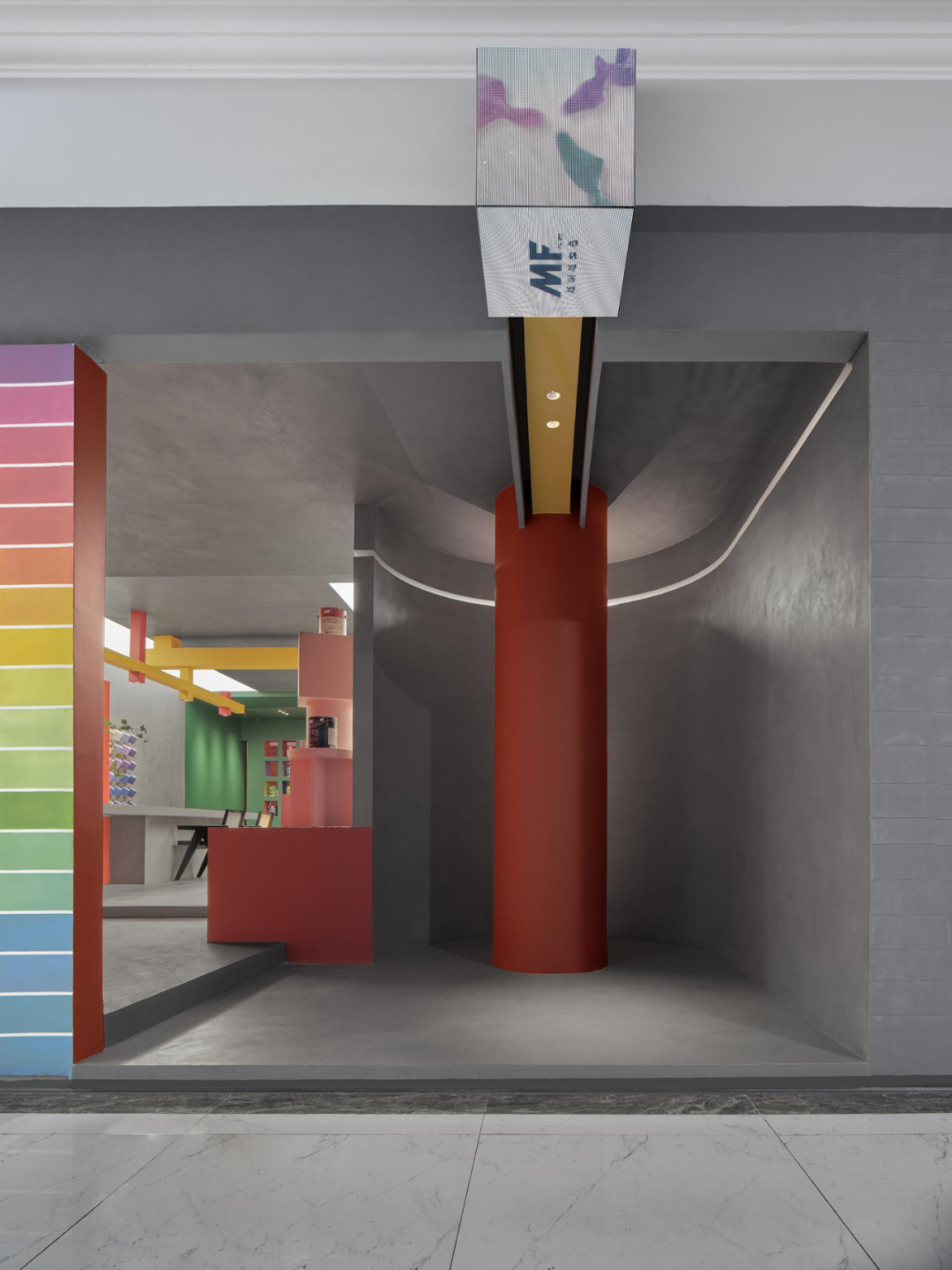
展厅外立面,设计师通过多形态、有节奏的几何方块,隐喻魔方的立体结构。并利用圆弧斜面的视觉原理、3D灯箱投影、“洞穴入口”等巧妙设计,使得展厅迅速从商场中脱颖而出,让空间设计延伸出引流价值。
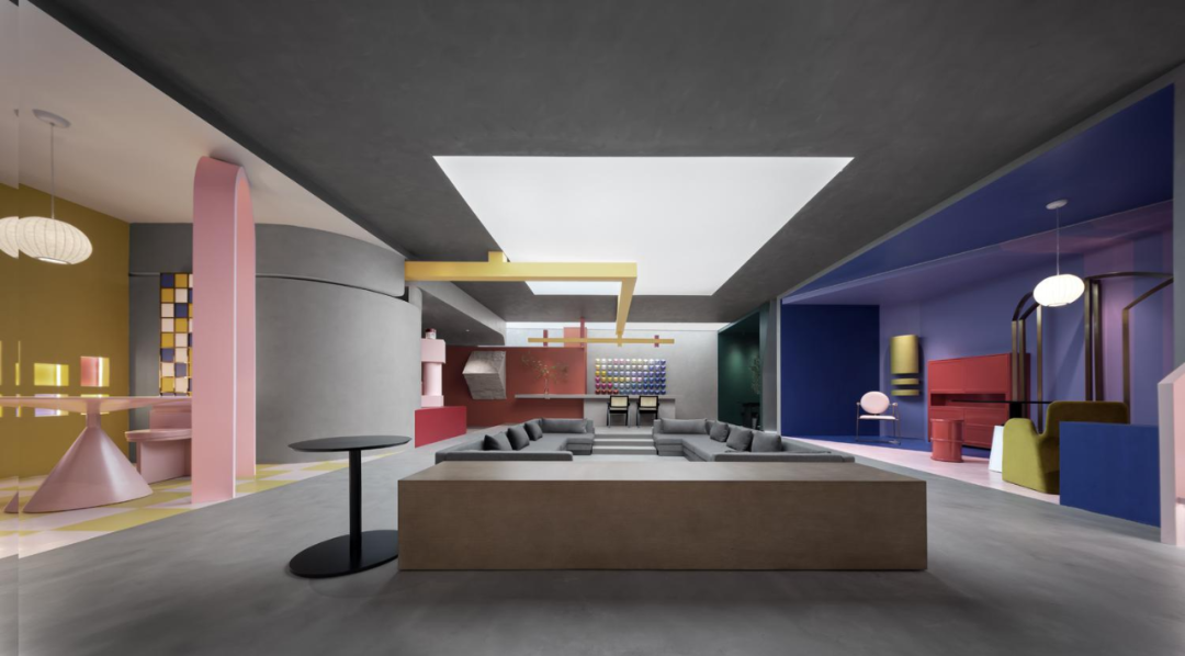
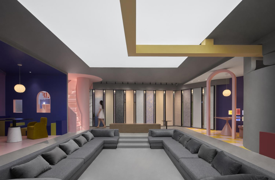
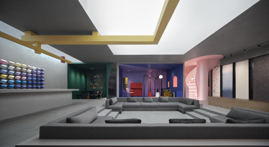
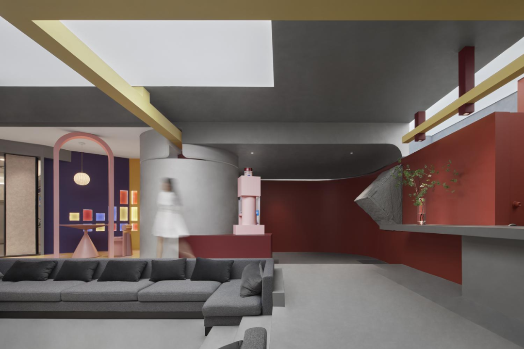
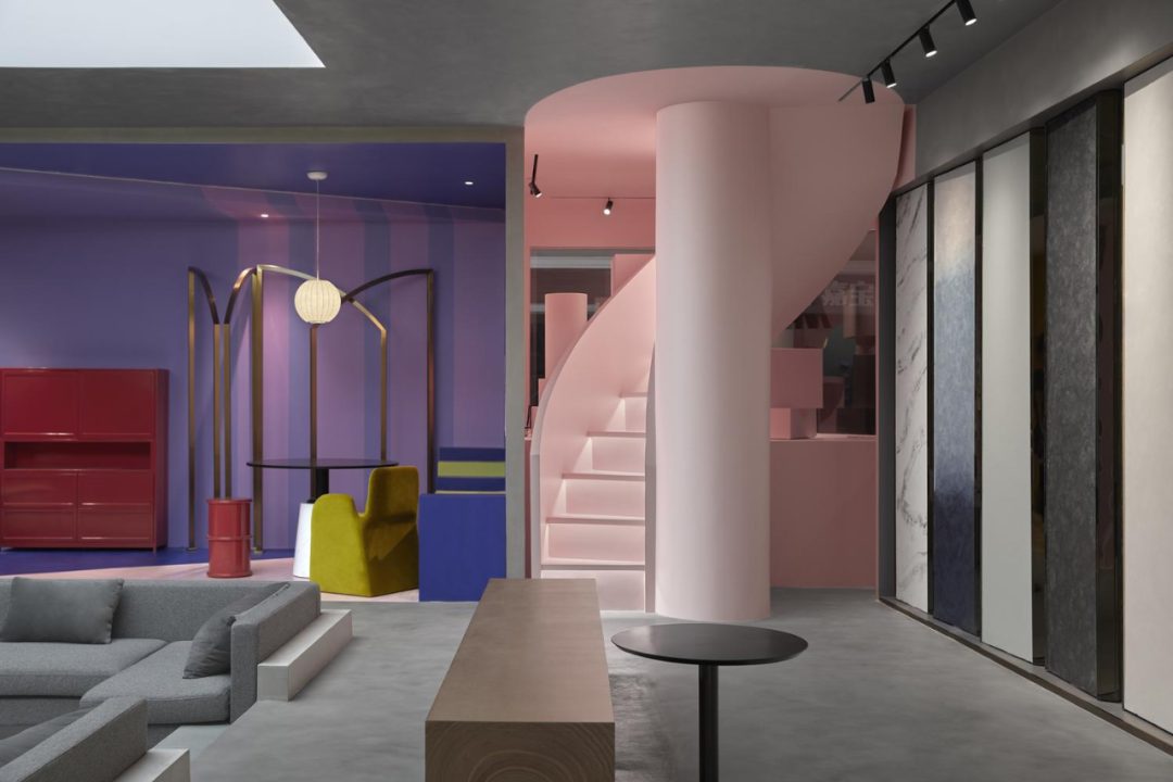
展厅内部,下沉式沙发区与天幕构成了「五阶魔方」的正中轴,二、四阶为环绕整个空间的环形动线,一、五阶集合了前台、产品展示、洽谈区等功能。通过在内部空间解构五阶魔方,创新地消除了实体墙面,制造形而上学的隔断,让展厅空间变身一个既开阔又丰富的沉浸式实体场域。
The "Magic Cube" project is located in Dongguan, China and is the brand exhibition hall of Canadian brand MF Coatings. Inspired by the brand positioning of the owner "Trendy Brand", designer Li Mingjin redefined spatial order with the inspiration of the "Five Step Magic Cube".
The exterior of the exhibition hall is designed by the designer to symbolize the three-dimensional structure of the Rubik's Cube through various forms and rhythmic geometric blocks. And utilizing the visual principle of curved inclined surfaces, 3D lightbox projection, and clever design such as "cave entrance", the exhibition hall quickly stands out from the mall, extending the drainage value of spatial design.
Inside the exhibition hall, the sunken sofa area and the canopy form the central axis of the "Five Step Magic Cube". The second and fourth steps form a circular flow around the entire space, while the first and fifth steps combine functions such as the front desk, product display, and negotiation area. By deconstructing the five step Rubik's Cube in the internal space, we innovatively eliminated physical walls and created metaphysical partitions, transforming the exhibition hall space into an immersive physical field that is both open and rich.
魔方▪艺术展厅设计
Rubik's Cube ▪ Art Exhibition Hall Design
-- -
受业主「潮牌」的定位启发,名津设计以「五阶魔方」为灵感,重新定义空间秩序。易学难精的经典玩具,契合了新潮而专业的品牌内核;魔方结构中暗含的对称、旋转等特性,赋予空间丰富的设计内涵与数学之美。
Inspired by the positioning of the owner's "trendy brand", Meitu Design redefines spatial order with the inspiration of the "Five Step Magic Cube". Classic toys that are easy to learn but difficult to refine, in line with the trendy and professional brand core; The symmetry and rotation inherent in the structure of the Rubik's Cube endow the space with rich design connotations and mathematical beauty.
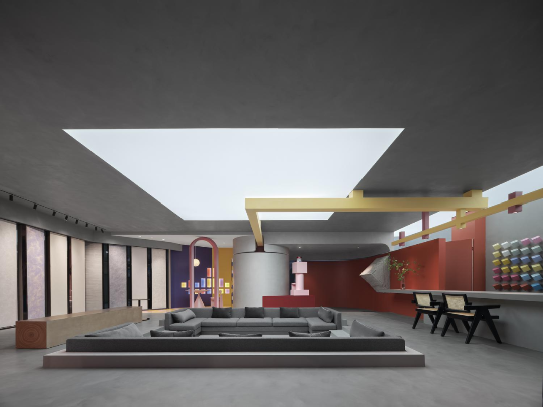
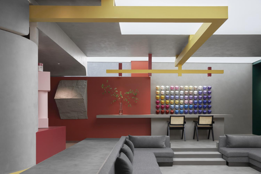
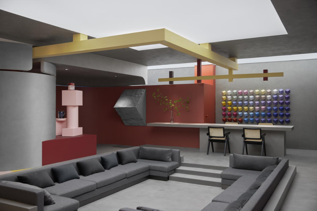
在五阶魔方中,下沉式沙发区与天幕构成了正中轴。中轴往外,二、四阶是环绕整个空间的环形动线,一、五阶集合了前台、产品展示、洽谈区等功能。
In the fifth order Rubik's Cube, the sunken sofa area and the canopy form the central axis. Moving outward from the central axis, the second and fourth stages form a circular flow around the entire space, while the first and fifth stages combine functions such as the front desk, product display, and negotiation area.
贯穿整体空间五阶结构,消解了在场的墙体,制造形而上学的隔断。既划分出相对独立的功能空间,让展示区化身被观看的剧场,聚焦局部之美;也让置身于实体场域中的体验者,能够一览开阔视野,极尽空间之大。
The five tiered structure runs through the entire space, dissolving the walls present and creating metaphysical partitions. Divide the display area into relatively independent functional spaces, transforming it into a theater to be watched and focusing on the beauty of the local area; It also allows the experiencer who is immersed in the physical field to have a broad view and maximize the space.
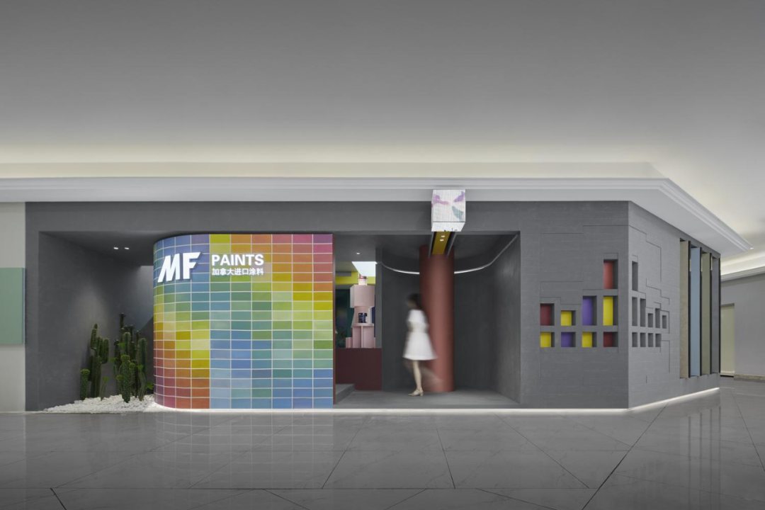
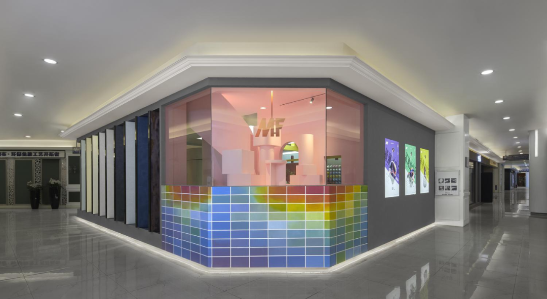
展厅外围立面,用多形态、有节奏的几何方块,在整体性与独特性之间找到微妙的平衡。既提升了外立面的丰富性与设计氛围,使展厅从商场中脱颖而出,又呼应内部空间的魔方结构,逐步搭建起理念的实体。
The exterior facade of the exhibition hall uses various forms and rhythmic geometric blocks to find a subtle balance between integrity and uniqueness. It not only enhances the richness and design atmosphere of the exterior facade, making the exhibition hall stand out from the mall, but also echoes the Rubik's Cube structure of the internal space, gradually building the entity of the concept.
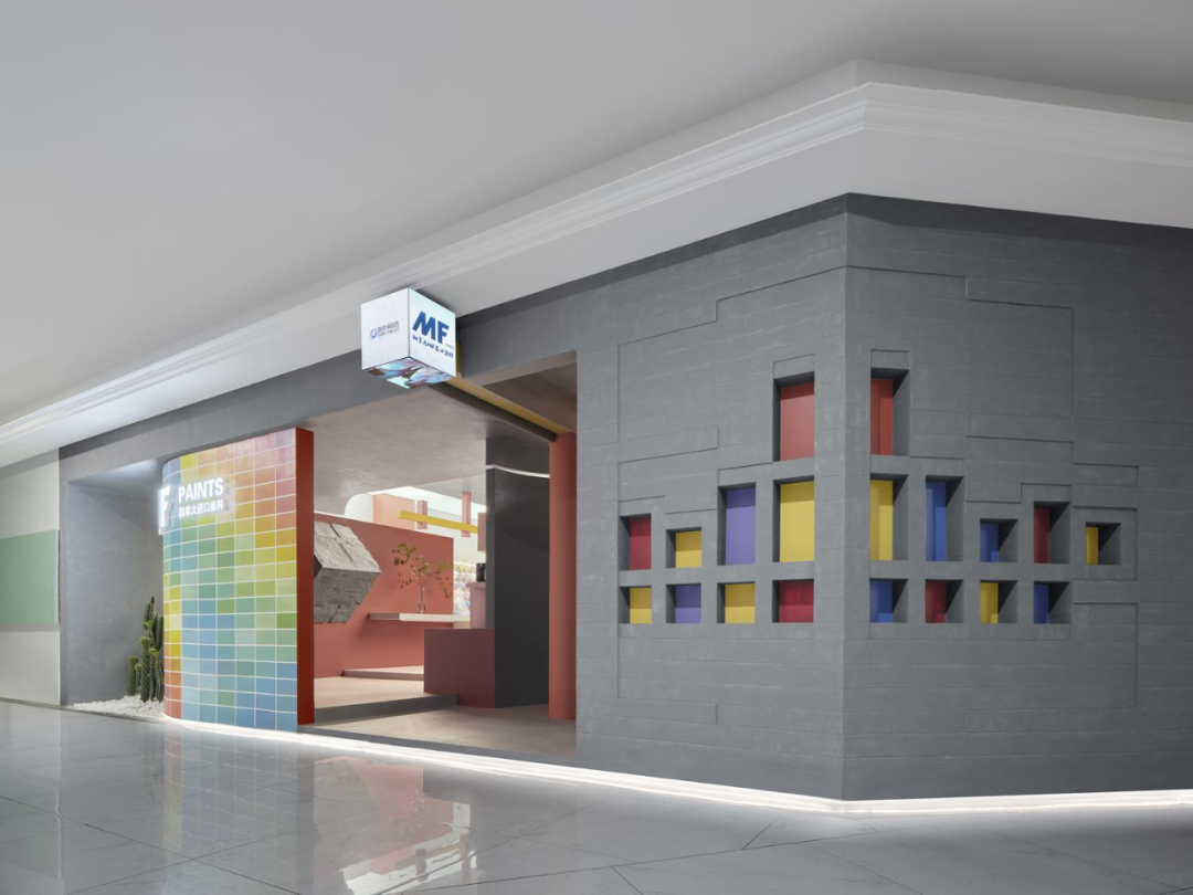
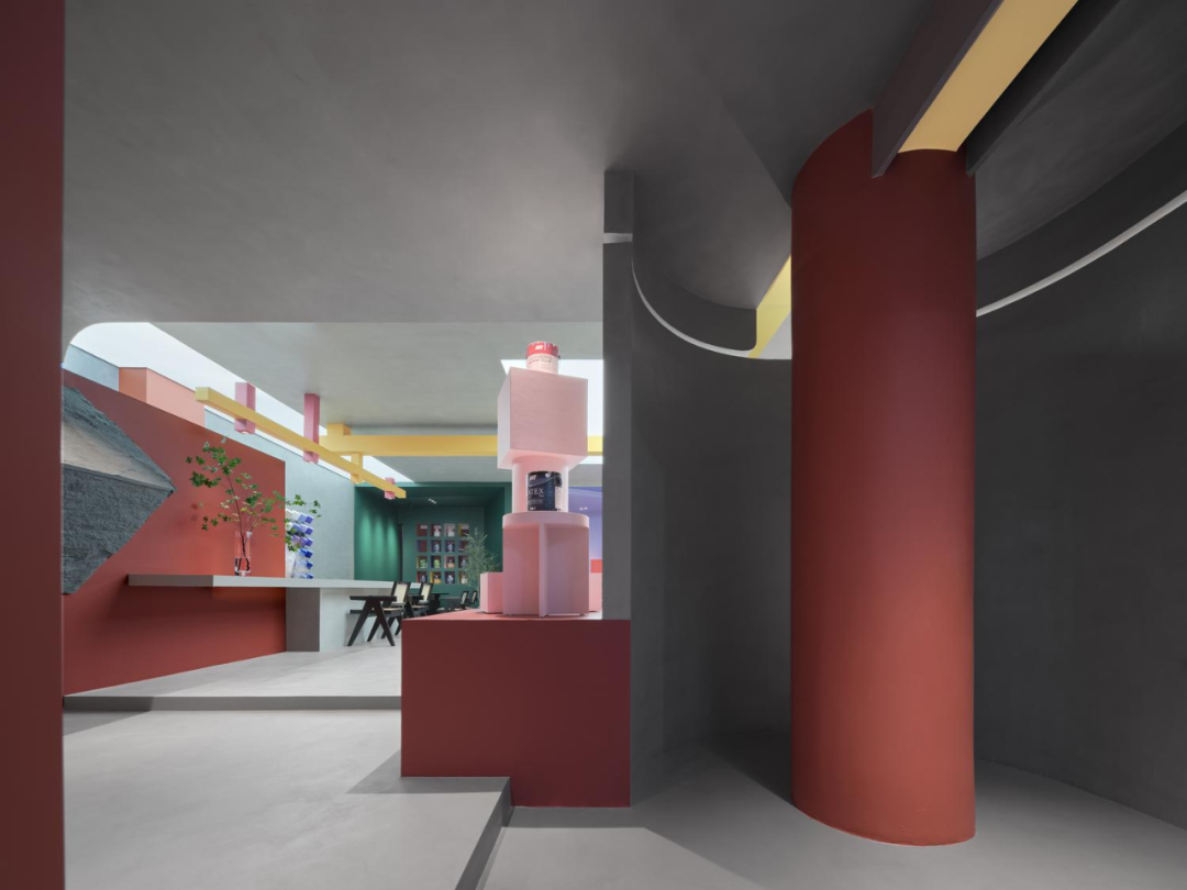
设计师巧妙地斜切四面体空间的两个对角,造成了结构上的形变。一方面化解空间内部的承重柱,另一方面布下破局之笔,四方板正魔方仿佛正在被无形的手扭转,整个结构变得灵活起来。
The designer cleverly slanted the two diagonals of the tetrahedral space, causing structural deformation. On the one hand, it resolves the load-bearing columns inside the space, and on the other hand, it lays a pen to break through the situation. The square shaped cube seems to be being twisted by an invisible hand, making the entire structure more flexible.
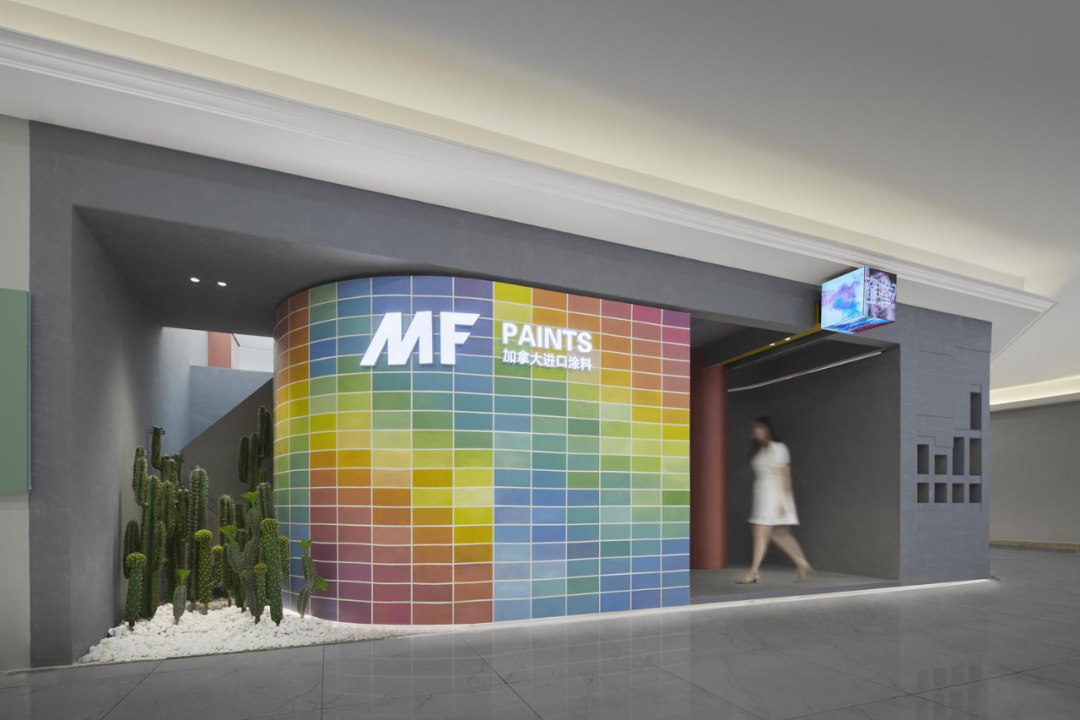
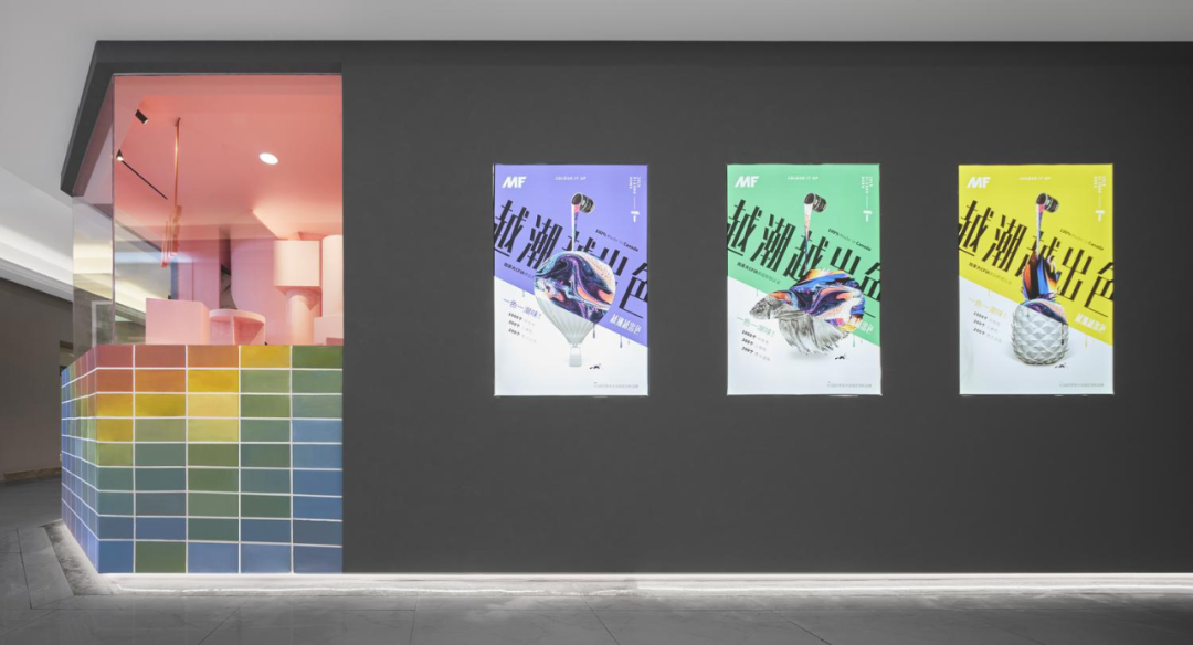
斜切对角暗藏巧思。展厅门口,用天幕模拟自然光为绿植供氧,凸显品牌的环保属性;同时,圆弧墙面利用视觉原理,让色彩丰富的品牌墙从平行走道中跃出,激发观者的好奇心,延伸出引流价值。另一侧的切角设置了广角橱窗,几何艺术装置的展示,提升品牌的潮流感,弱化商业属性。
Diagonal cutting hides clever ideas. At the entrance of the exhibition hall, a canopy is used to simulate natural light and supply oxygen to green plants, highlighting the brand's environmental attributes; At the same time, the curved wall surface utilizes visual principles to allow the colorful brand wall to leap out from parallel corridors, stimulating viewers' curiosity and extending its drainage value. On the other side, a wide-angle display window and geometric art installation are set up to enhance the brand's trendiness and weaken its commercial attributes.
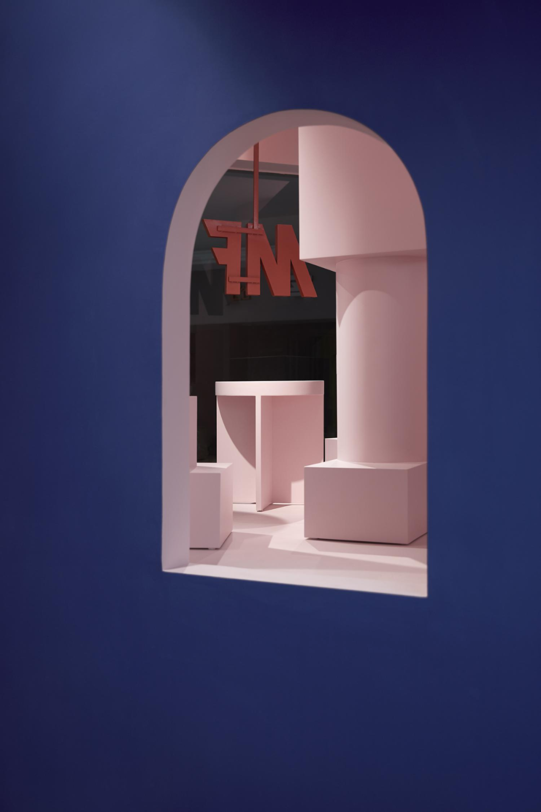
从门口的方盒3D投影开始,设计师在空间内暗藏多处隐喻叙事。通过一步一景,见结构之一角,窥魔方之全貌,形成严丝合缝的整体关系。
Starting from the 3D projection of the square box at the entrance, the designer has hidden multiple metaphorical narratives in the space. By taking one step at a time and observing a corner of the structure, one can glimpse the full picture of the Rubik's Cube and form a seamless overall relationship.
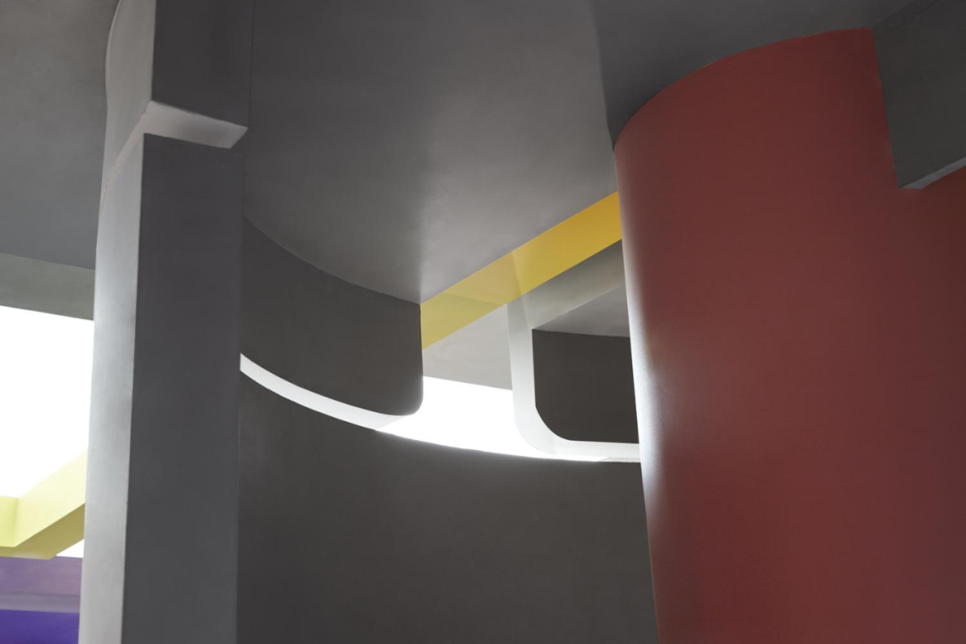
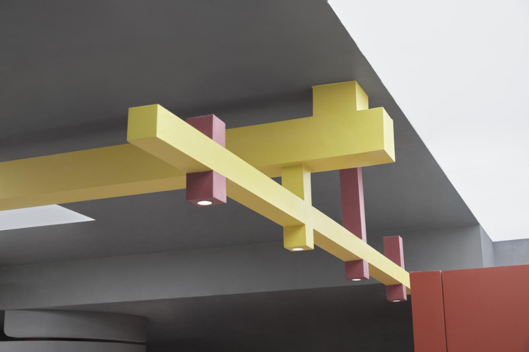
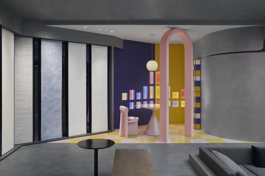
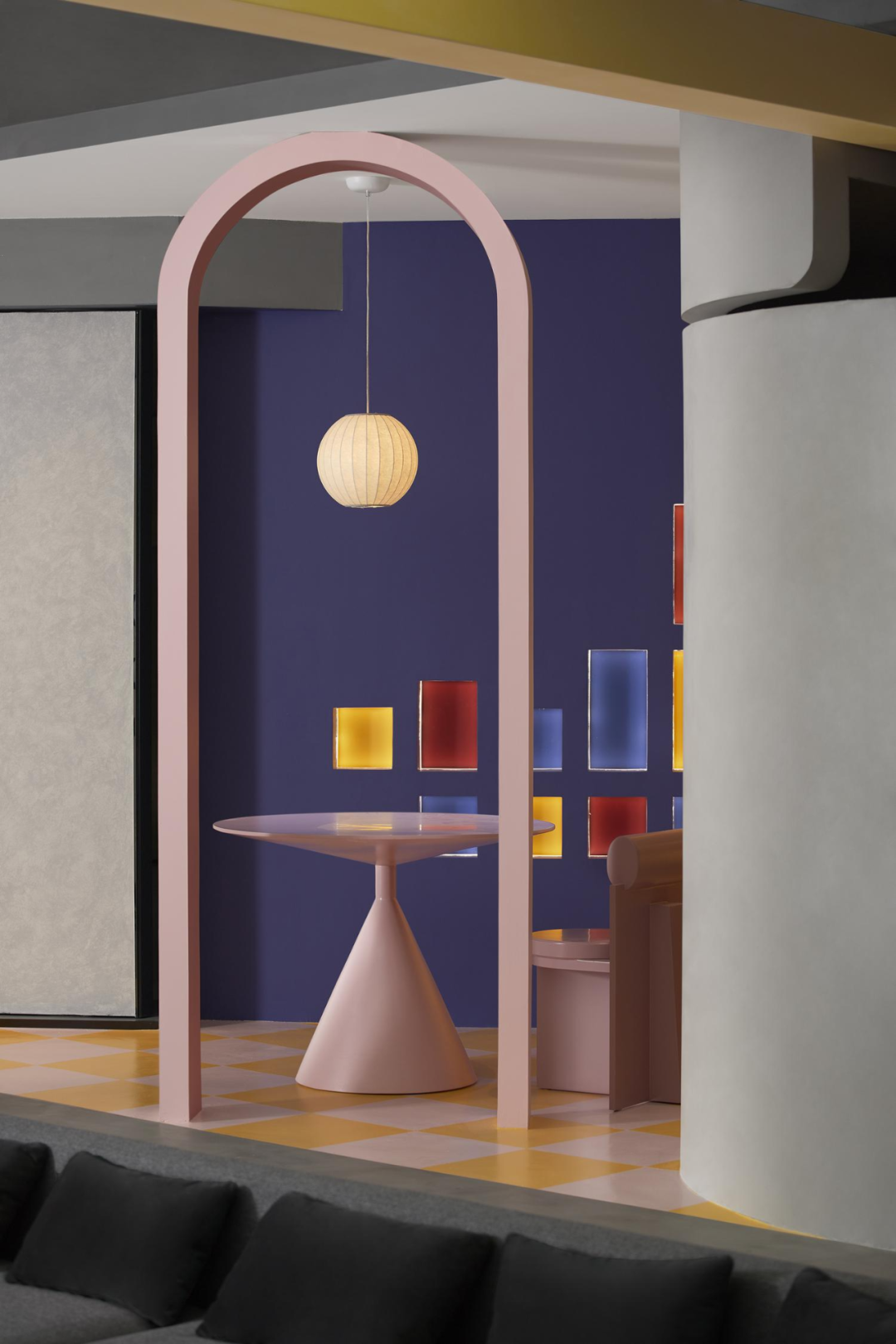
明黄色的矩形结构,自门口天花中轴线贯穿至空间中心点、再90°对折,既提示了五阶魔方的对称轴,增添结构趣味,还埋下一个「时间」概念的彩蛋,等待体验者去揭晓。
The bright yellow rectangular structure runs through the central axis of the doorway ceiling to the center point of the space, and then folds in half at a 90 degree angle. It not only highlights the symmetry axis of the fifth order Rubik's Cube, adding structural fun, but also buries an Easter egg of the concept of "time", waiting for the experiencer to reveal.
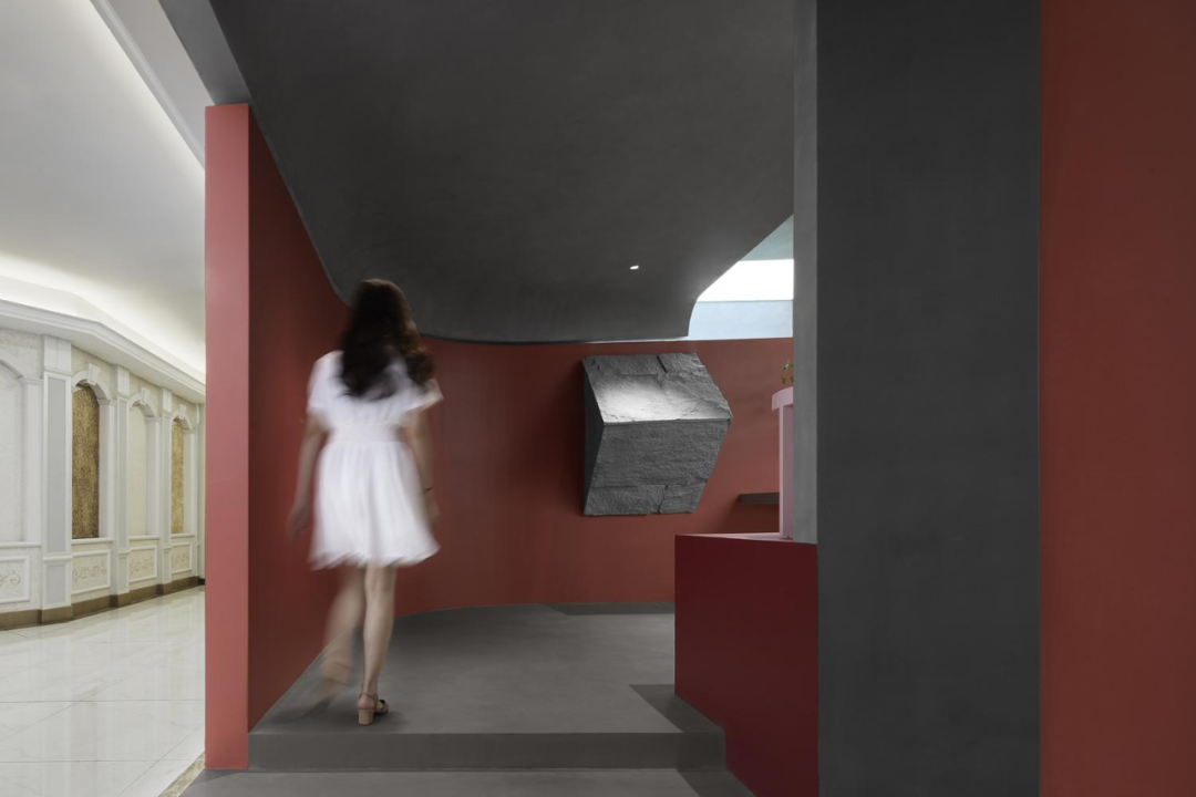
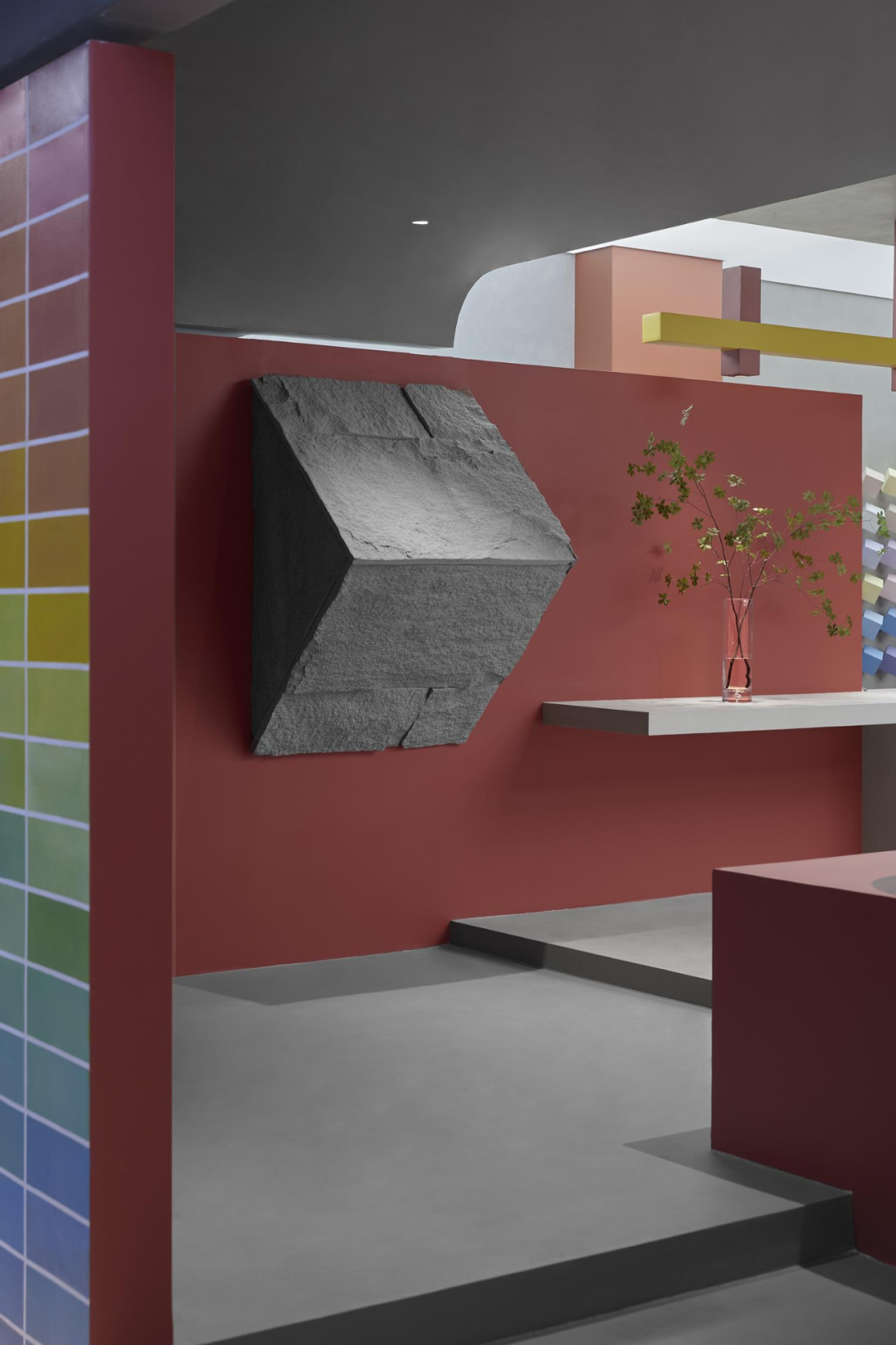
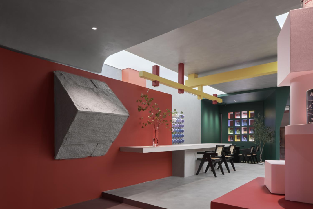
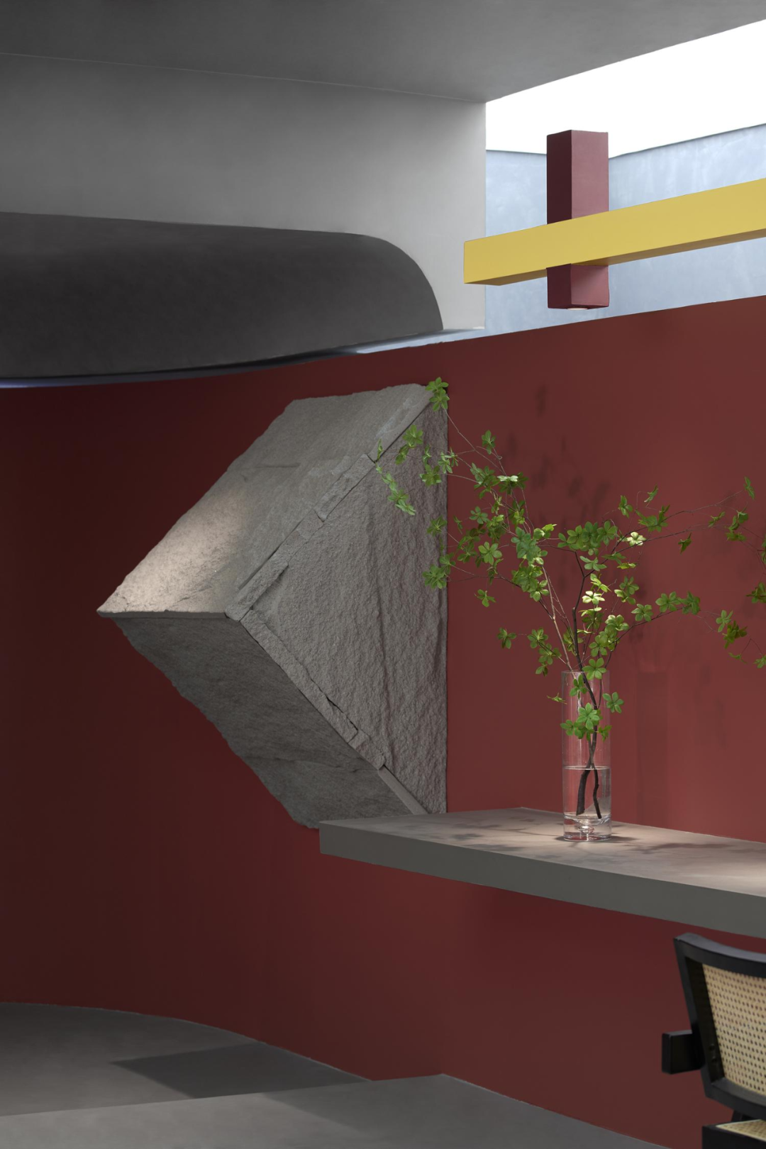
破墙而入的魔方一角,极具戏剧张力,将空间的立体属性暴露无遗。原始粗糙的石材,与外立面的自然景观「里应外合」,强化天然环保的产品特质。
The corner of the Rubik's Cube that broke through the wall is extremely dramatic, revealing the three-dimensional properties of the space. The raw and rough stone, combined with the natural landscape of the facade, enhances the natural and environmentally friendly product characteristics.
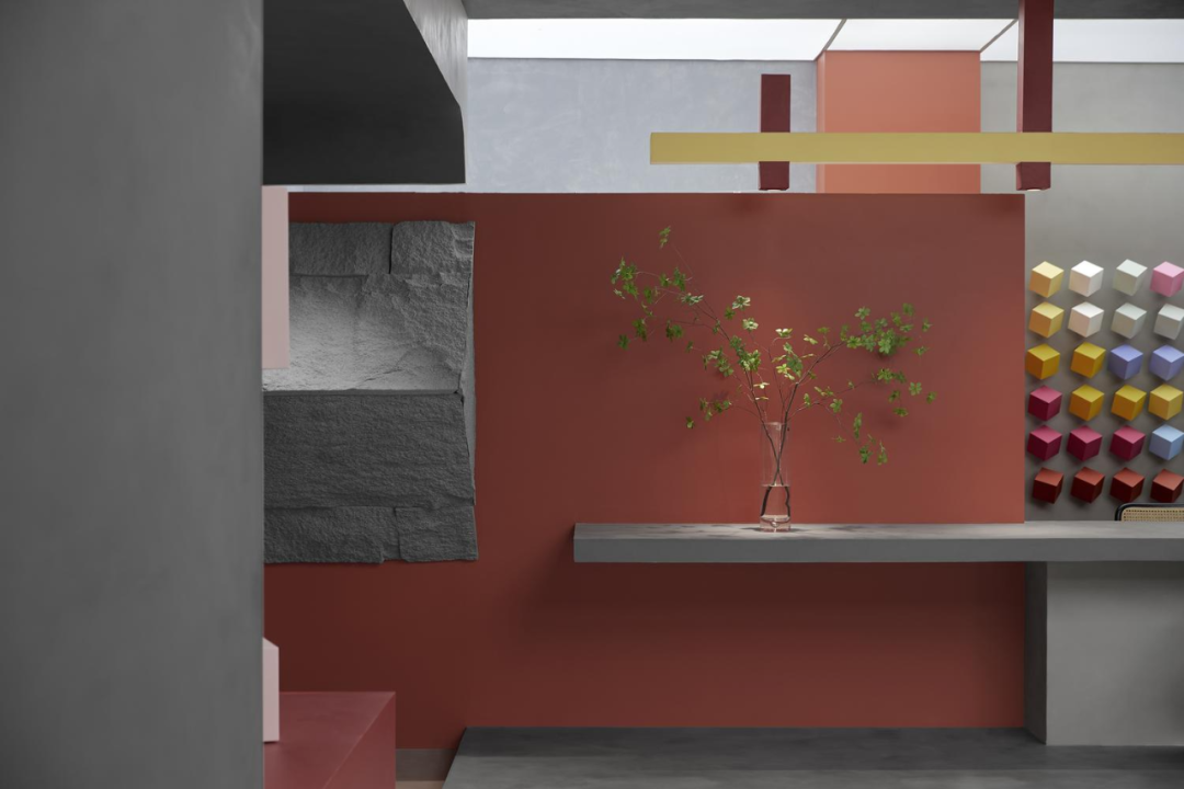
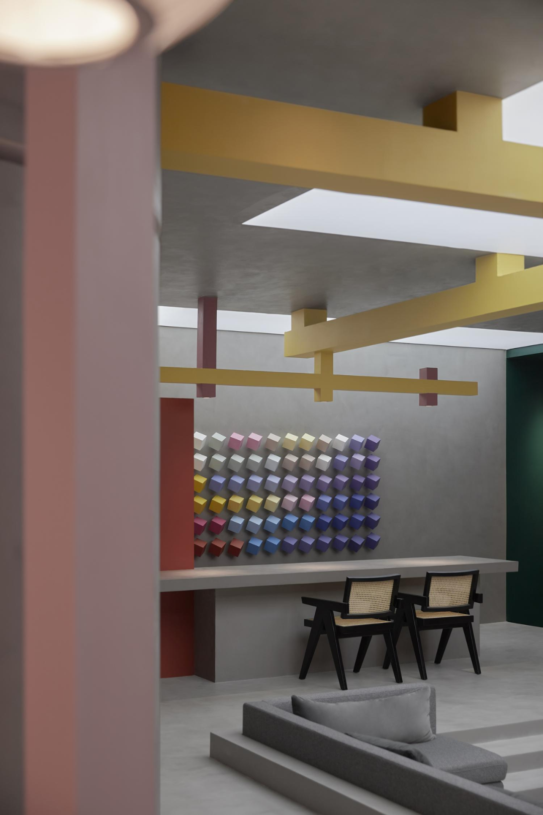
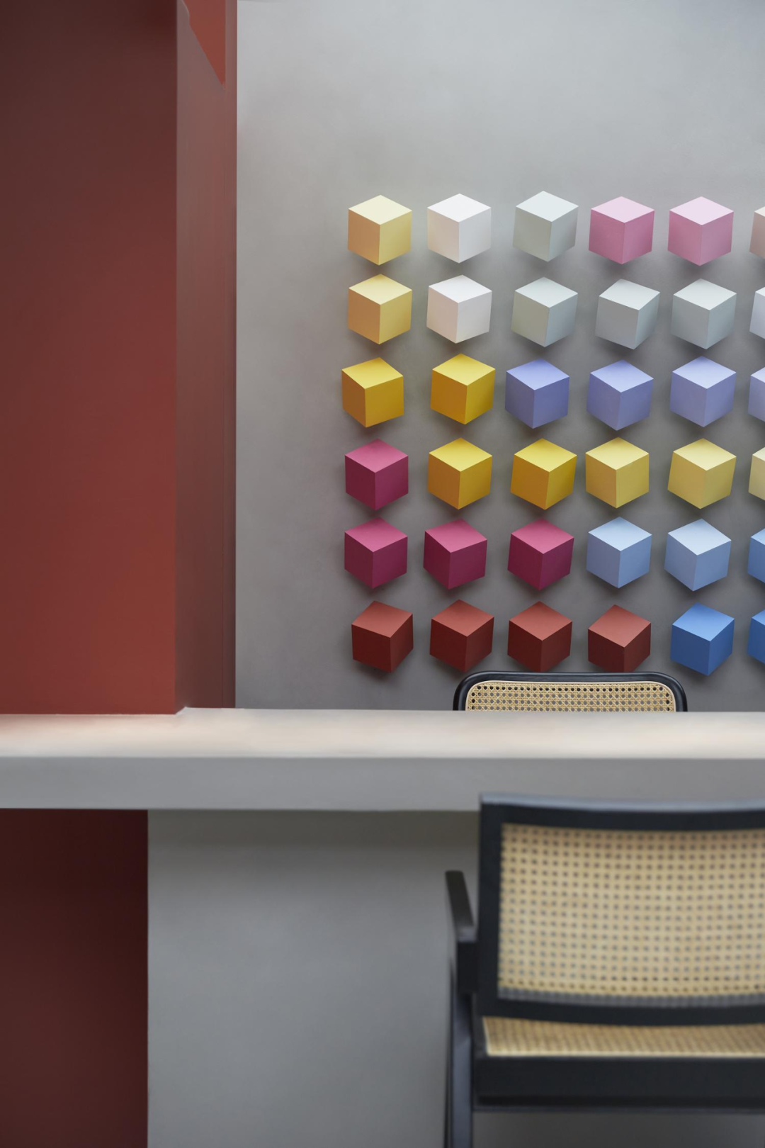
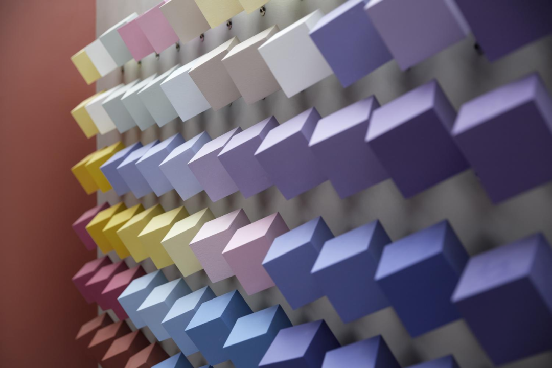
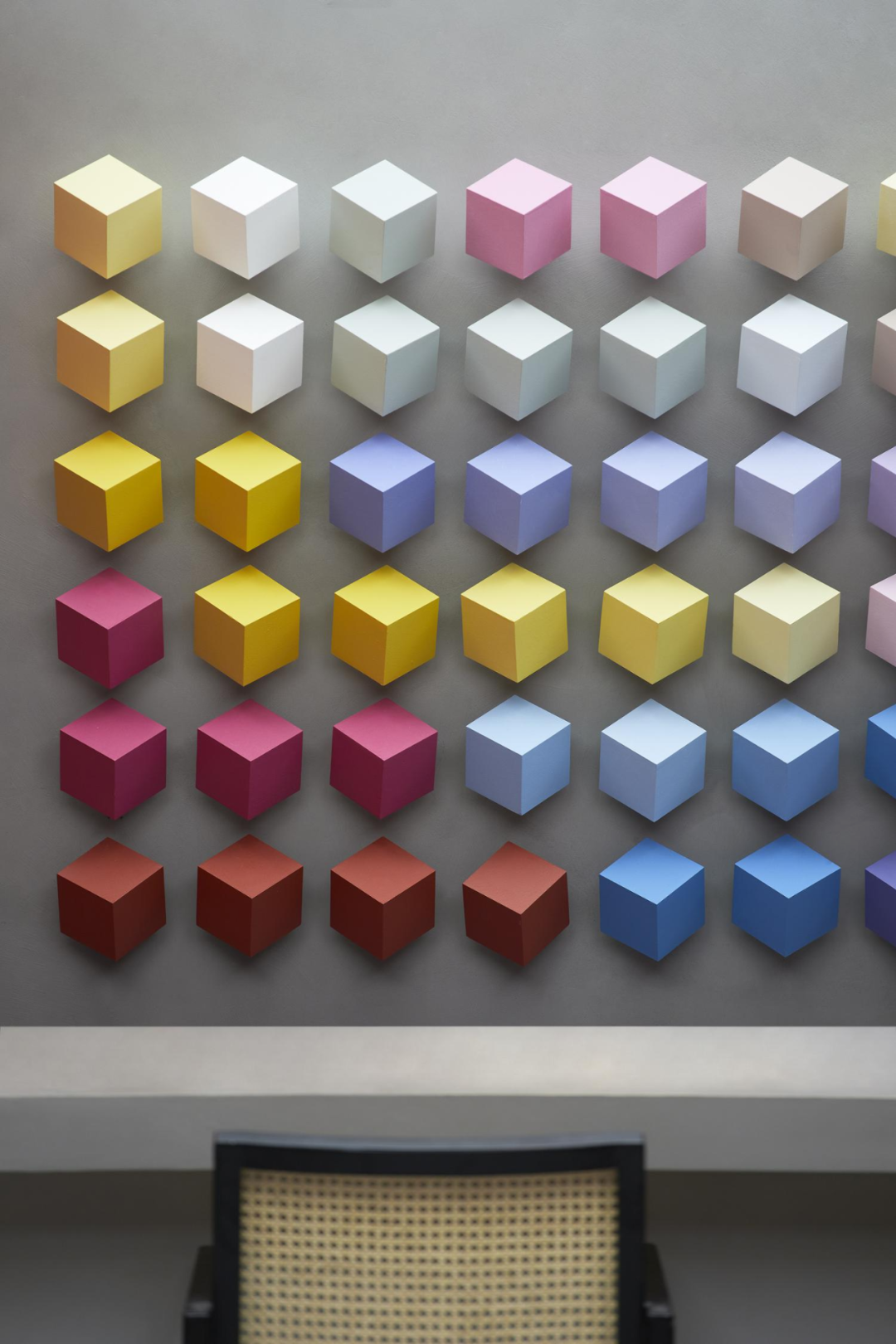
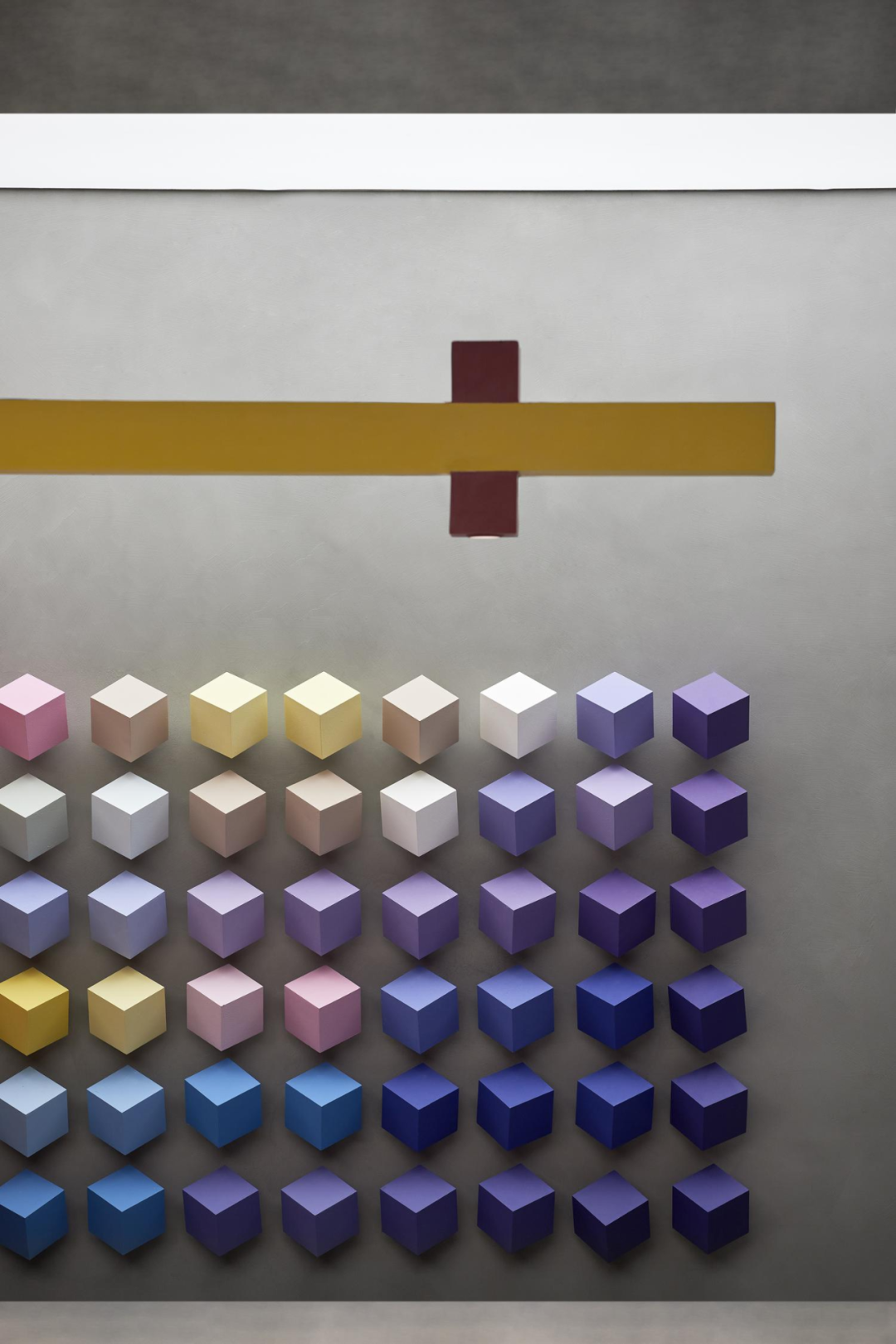
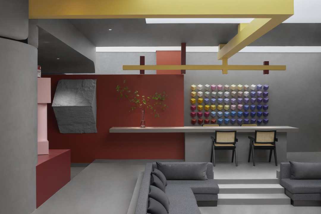
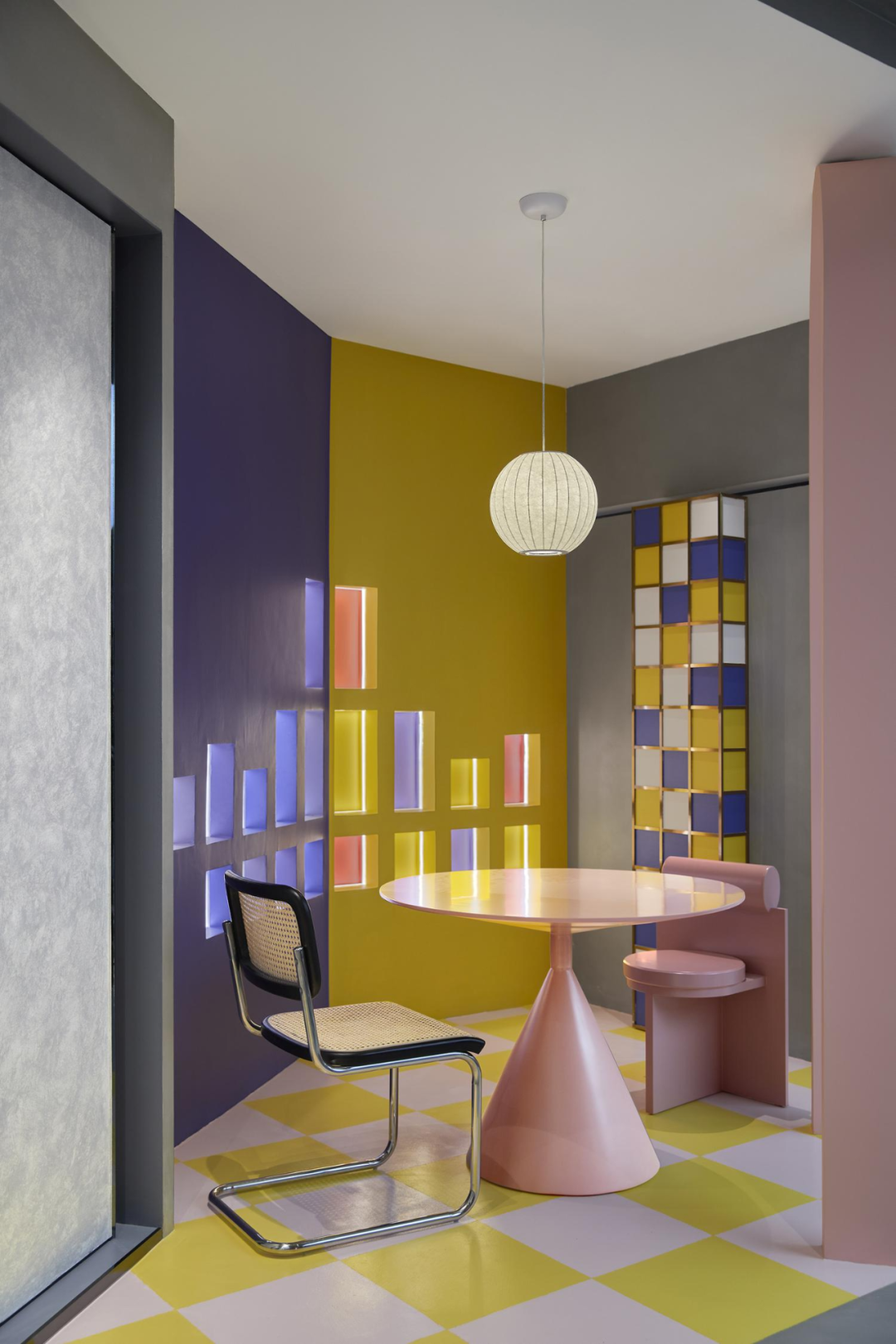
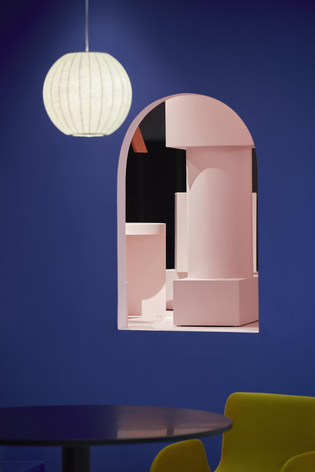
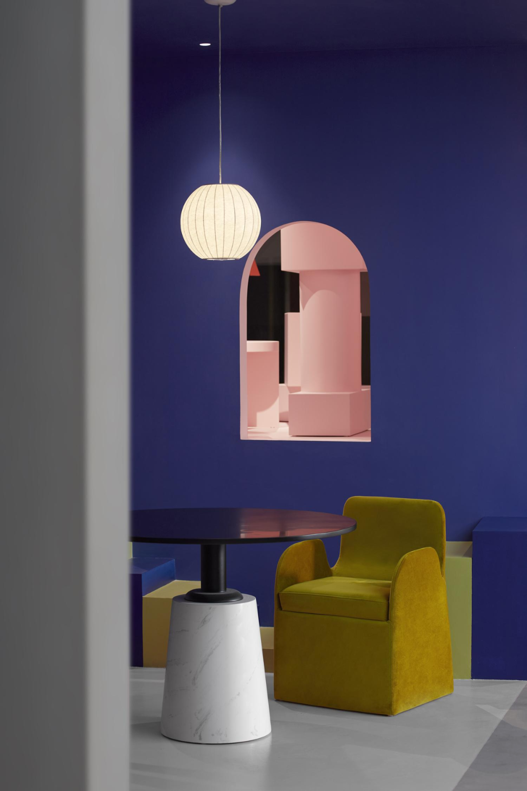
前台的魔方背景墙,仿佛一幅现代主义装饰画。空间内容主题的色彩属性、结构主题的魔方属性,在这里得到最浑然天成的交织与对话,一切都那么优雅而内敛、润物细无声。
The Rubik's Cube background wall at the front desk resembles a modernist decorative painting. The color attribute of the spatial content theme and the Rubik's Cube attribute of the structural theme are interwoven and dialogue in the most natural way here, everything is so elegant and introverted, smooth and silent.
设计师将不同色彩统摄在春、夏、秋、冬四季主题之下,隐喻四季更迭、时光流转,与前面所提的「时间」彩蛋一起,塑造四时人生。
The designer incorporates different colors under the themes of spring, summer, autumn, and winter, symbolizing the changing seasons and the passage of time. Together with the previously mentioned "time" Easter egg, it shapes a life of four seasons.
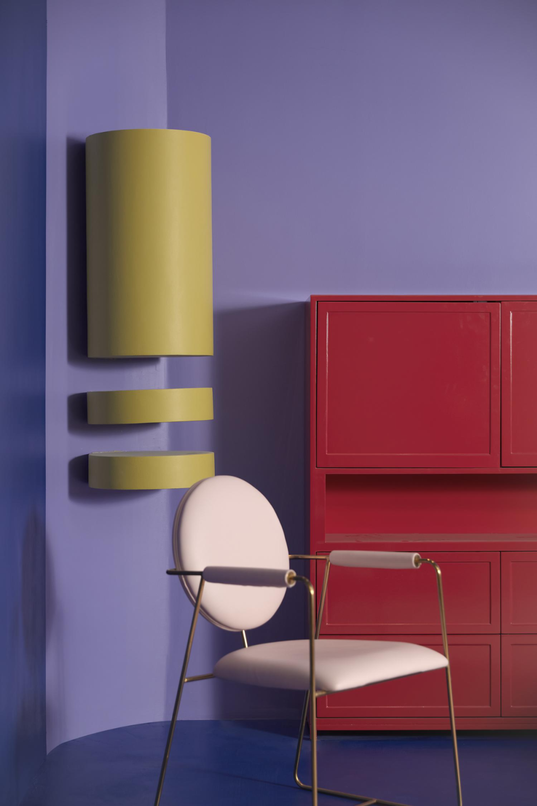
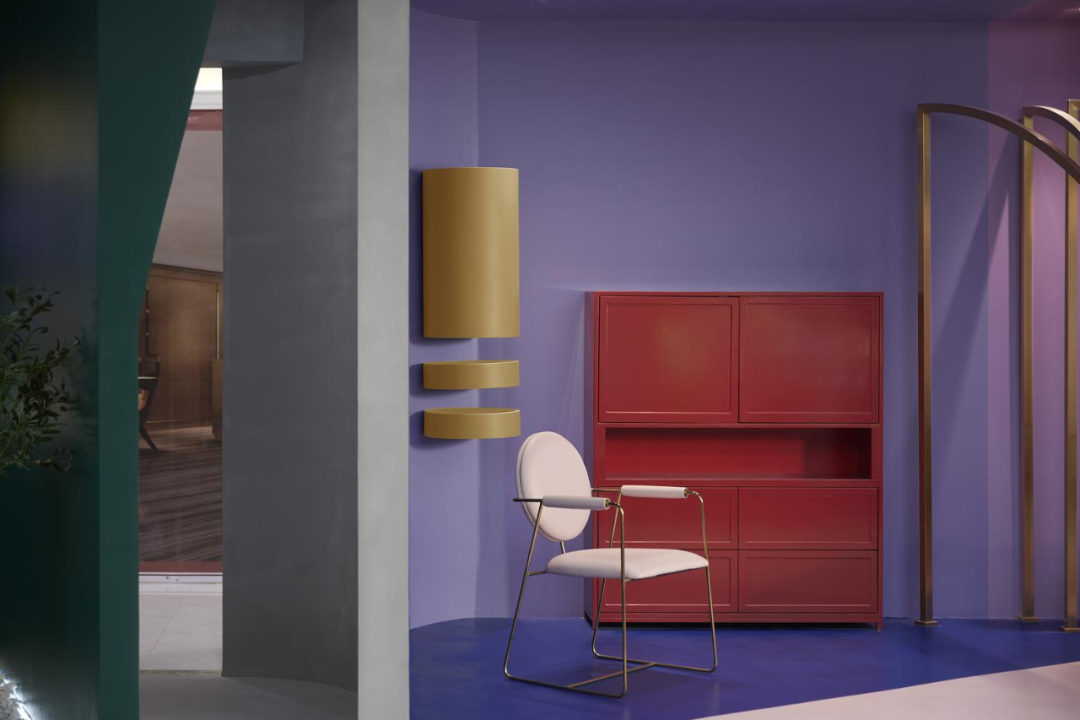
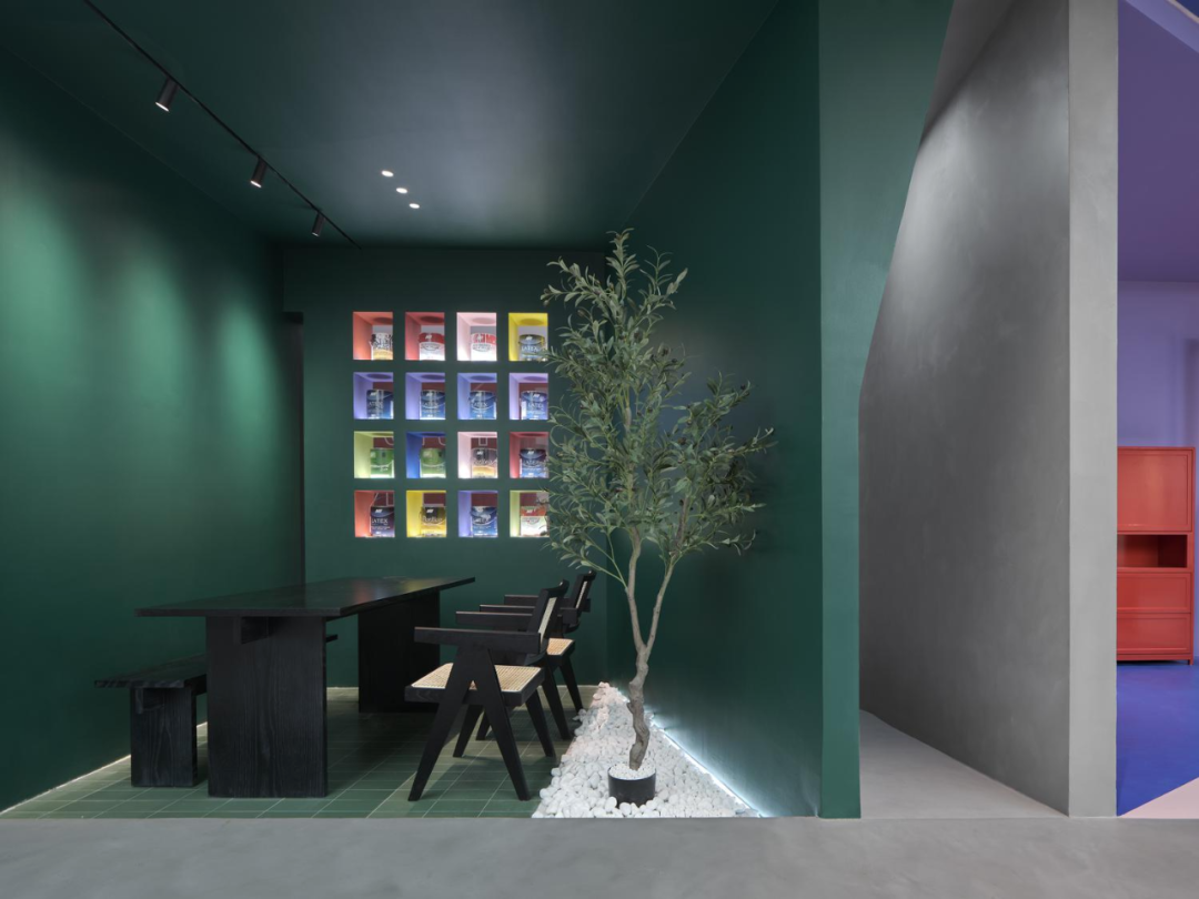
代表春的墨绿、秋的奶酪黄、夏的烈焰红和冬的靛蓝,演绎了一个个独立的场景空间,这里既是洽谈区,又仿佛是发生在体验者面前的一幕幕生活剧。
Representing the dark green of spring, the cheese yellow of autumn, the fiery red of summer, and the indigo of winter, each scene space is interpreted independently. This is not only a negotiation area, but also seems to be a series of life dramas happening in front of the experiencer.
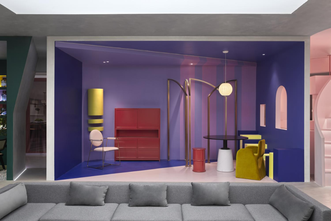
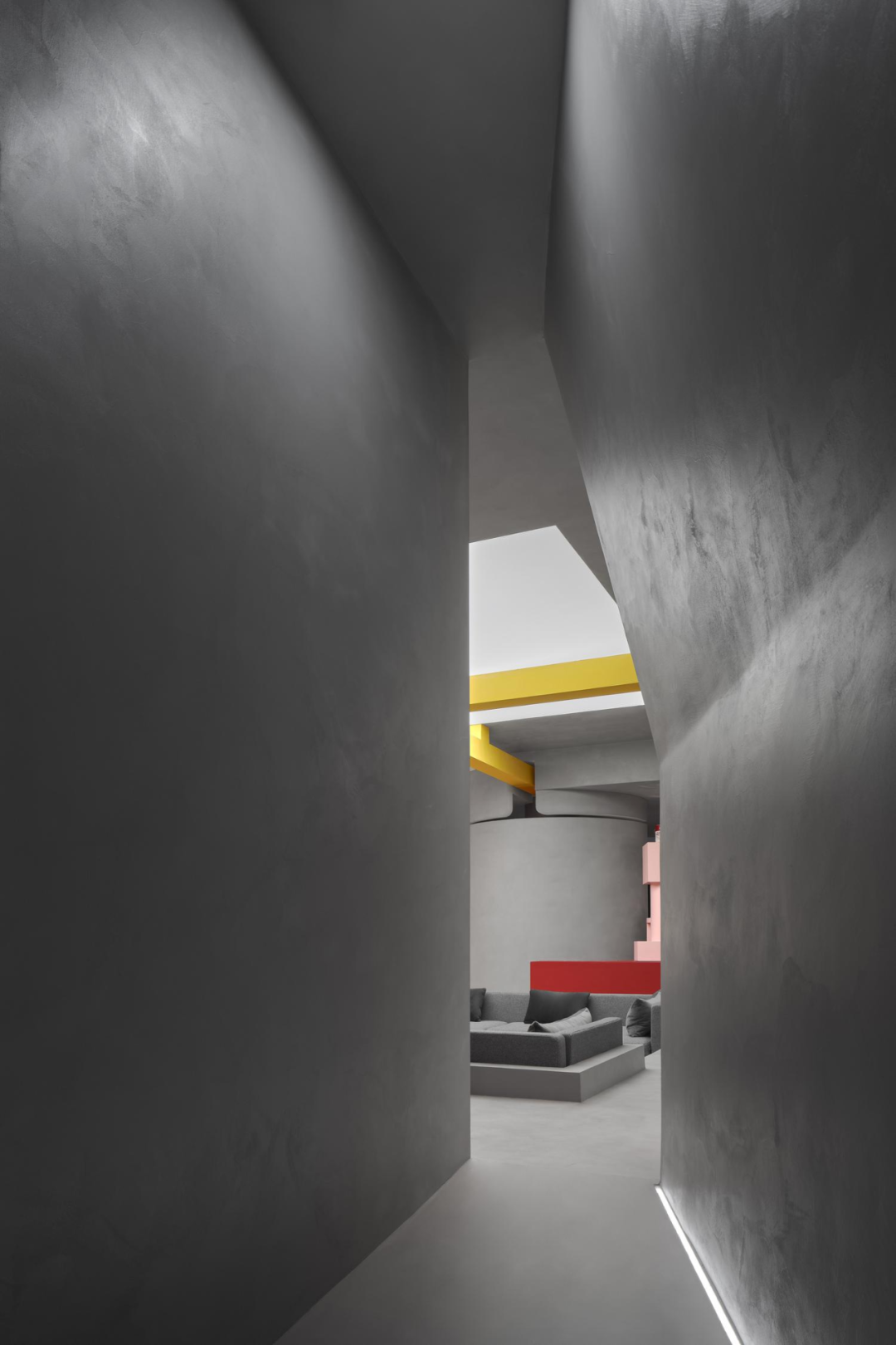
贯穿整体空间的微水泥提供了中性而沉稳的灰色基调,让缤纷色彩在空间内获得收敛与平衡,升华了整体空间的艺术感。
The micro cement that runs through the entire space provides a neutral and steady gray tone, allowing colorful colors to converge and balance in the space, elevating the artistic sense of the overall space.
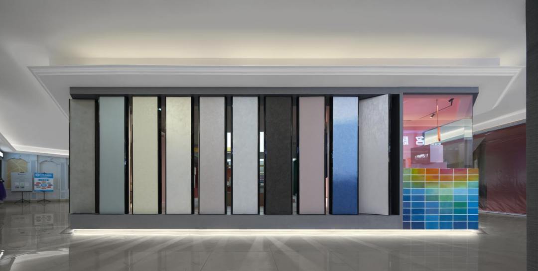
如何在涂料展厅呈现色彩,是考验设计师整体把控力的核心环节。
How to present colors in the paint exhibition hall is the core link that tests the designer's overall control.
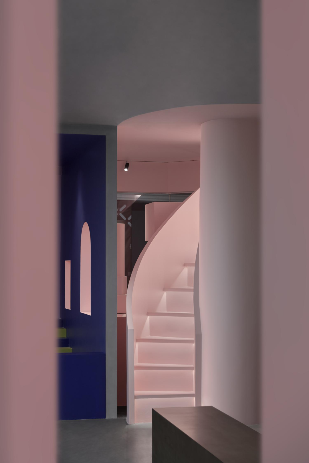
摒弃了实体隔断,空间开阔性得到最大化的彰显,但也可能因过于直白,丧失了空间的婉约与丰盈。
Abandoning physical partitions maximizes the openness of the space, but it may also lose the elegance and richness of the space due to being too straightforward.
设计师通过各种形态的门洞,在规整秩序的空间中,偷出一条条错综而又隐秘的轻盈通道,彻底激发空间活力。
Designers use various forms of doorways to create intricate and hidden light passages in orderly spaces, thoroughly stimulating the vitality of the space.
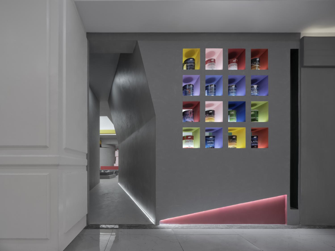
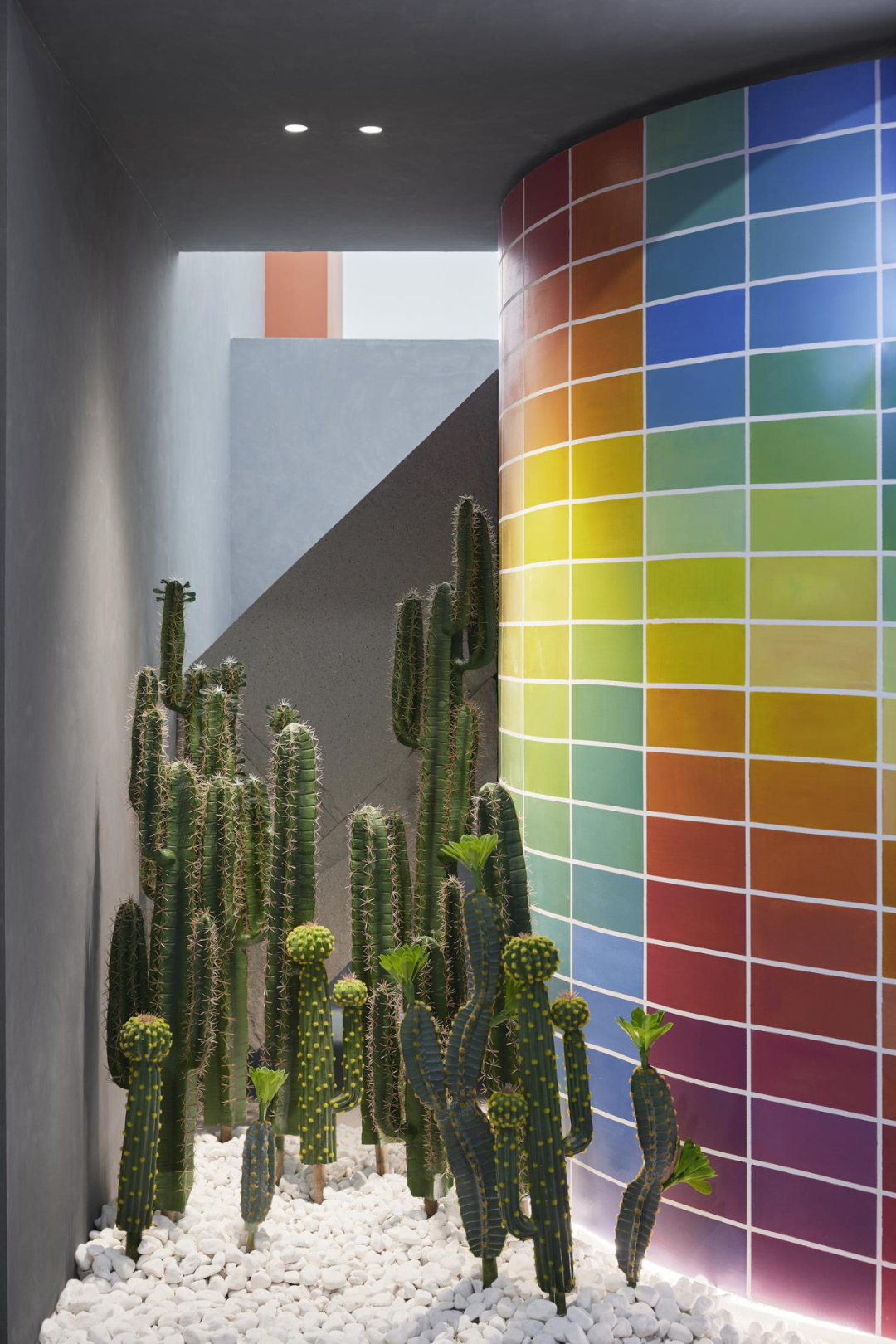
展厅另一处隐秘的入口,提供了类似的、饶有趣味的空间体验。狭长而不规则的走道,外宽内窄。误入桃源秘境,仿佛若有光,勾引着旁观者的窥视欲。
设计师深谙园林造景的精髓,微水泥压低了走道的整体亮度,让空间内的饱满色彩与敞亮的天幕得到最大化的展示,路过的人都忍不住一窥究竟。
Another hidden entrance to the exhibition hall provides a similar and interesting spatial experience. A narrow and irregular corridor, wide on the outside and narrow on the inside. Accidentally entering the secret realm of Peach Blossom Land, as if there were light, tempting the voyeuristic desires of onlookers.
The designer is well versed in the essence of landscape design. Micro cement lowers the overall brightness of the walkway, maximizing the display of full colors and bright canopies in the space. Passers by cannot help but take a peek.