-
2025-11-06
欧思兰化妆品展厅设计解析:多感官体验与欧美元素融合
© 徐英达
感官在《汉典》中被解释为感受外界事物刺激的感觉器官。亚里士多德将人体的感官分为五种,即触觉、嗅觉、味觉、听觉和视觉。在《设计中的设计》一书中,日本著名建筑设计师原研哉将感官体验理论及其应用进行了相应的阐释,并提出“了解人的感觉及感受形式,然后利用设计让受众得到并了解讯息,是二十一世纪设计发展的新方向”。
Sensory organs are explained in the Han Dynasty as sensory organs that sense external stimuli. Aristotle divided the human senses into five types, namely touch, smell, taste, hearing, and sight. In the book "Design in Design", the famous Japanese architect Hara Kenya explained the theory and application of sensory experience, and proposed that "understanding human feelings and forms of feeling, and then using design to enable the audience to obtain and understand information, is a new direction for the development of design in the 21st century".
欧思兰化妆品展厅
Oslan Cosmetics Exhibition Hall
-- -
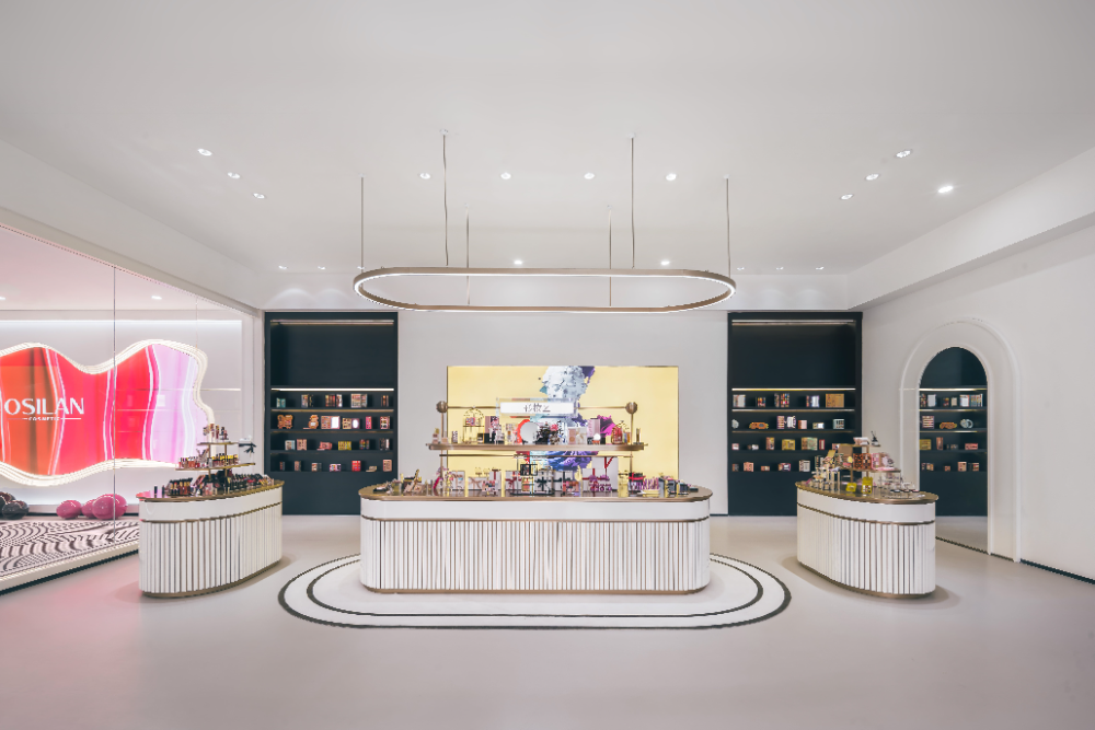
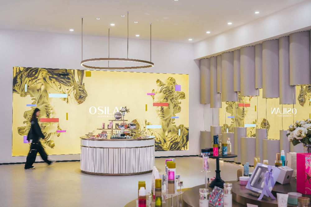
湖州欧思兰企业展示空间位于中国浙江省湖州市吴兴区—湖州欧思兰化妆品有限公司。该项目突破传统的以视觉和和听觉为中心的设计手段,转向了以多感官协调共同发展的体验式设计。从多方位、多角度地去刺激人的感官系统,给人带来身临其境的感官体验,更精准地向人诠释和传递信息以及情感。将该设计策略结合场地现状,并运用科技和一定的美学艺术,使企业形象、文化和产品得到一定的影响力传播。
The Huzhou Ousi Lan Enterprise Exhibition Space is located in Wuxing District, Huzhou City, Zhejiang Province, China - Huzhou Ousi Lan Cosmetics Co., Ltd. This project breaks through the traditional design approach centered on visual and auditory senses, and shifts towards experiential design that promotes the coordinated development of multiple senses. Stimulating the human sensory system from multiple perspectives and angles, providing an immersive sensory experience, and more accurately interpreting and conveying information and emotions to people. By integrating the design strategy with the current site conditions and utilizing technology and certain aesthetic arts, the company's image, culture, and products can gain a certain level of influence and dissemination.
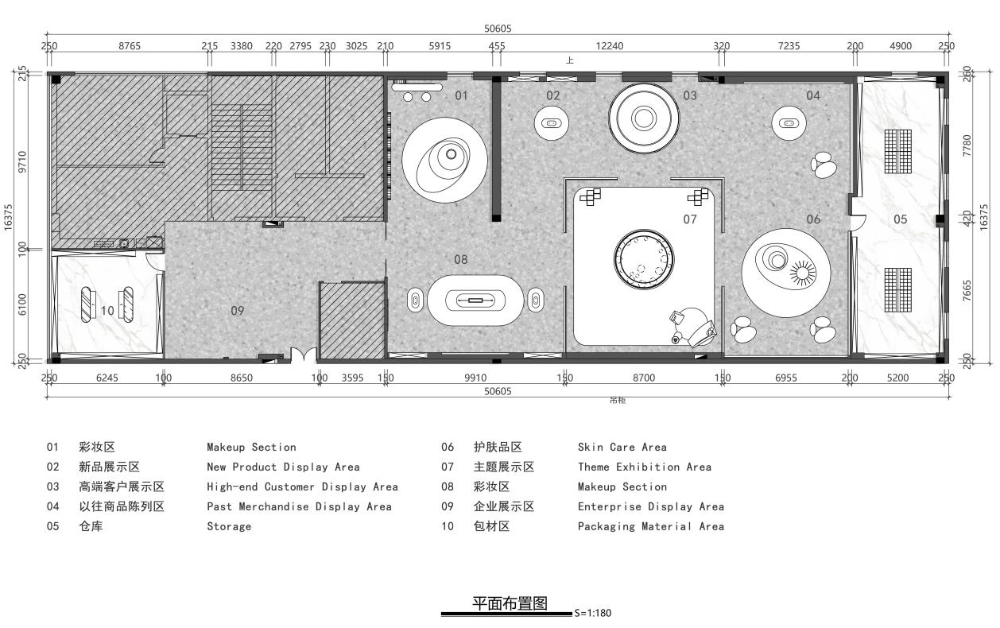
▼ 平面布局及人流动线
©平介设计
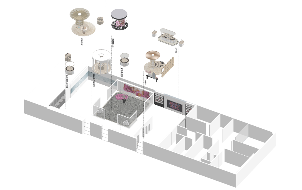
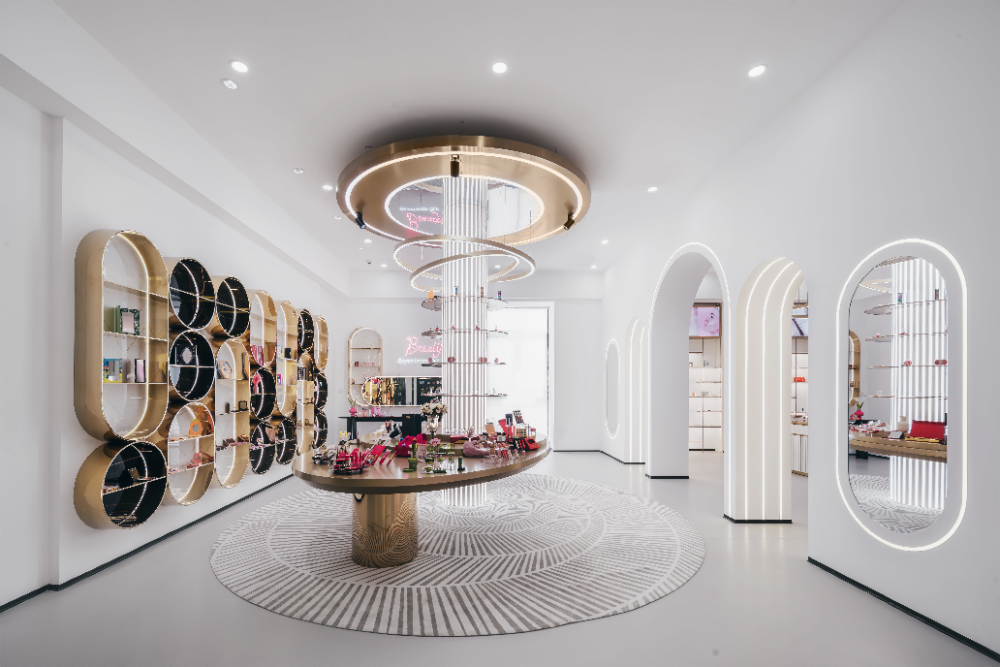
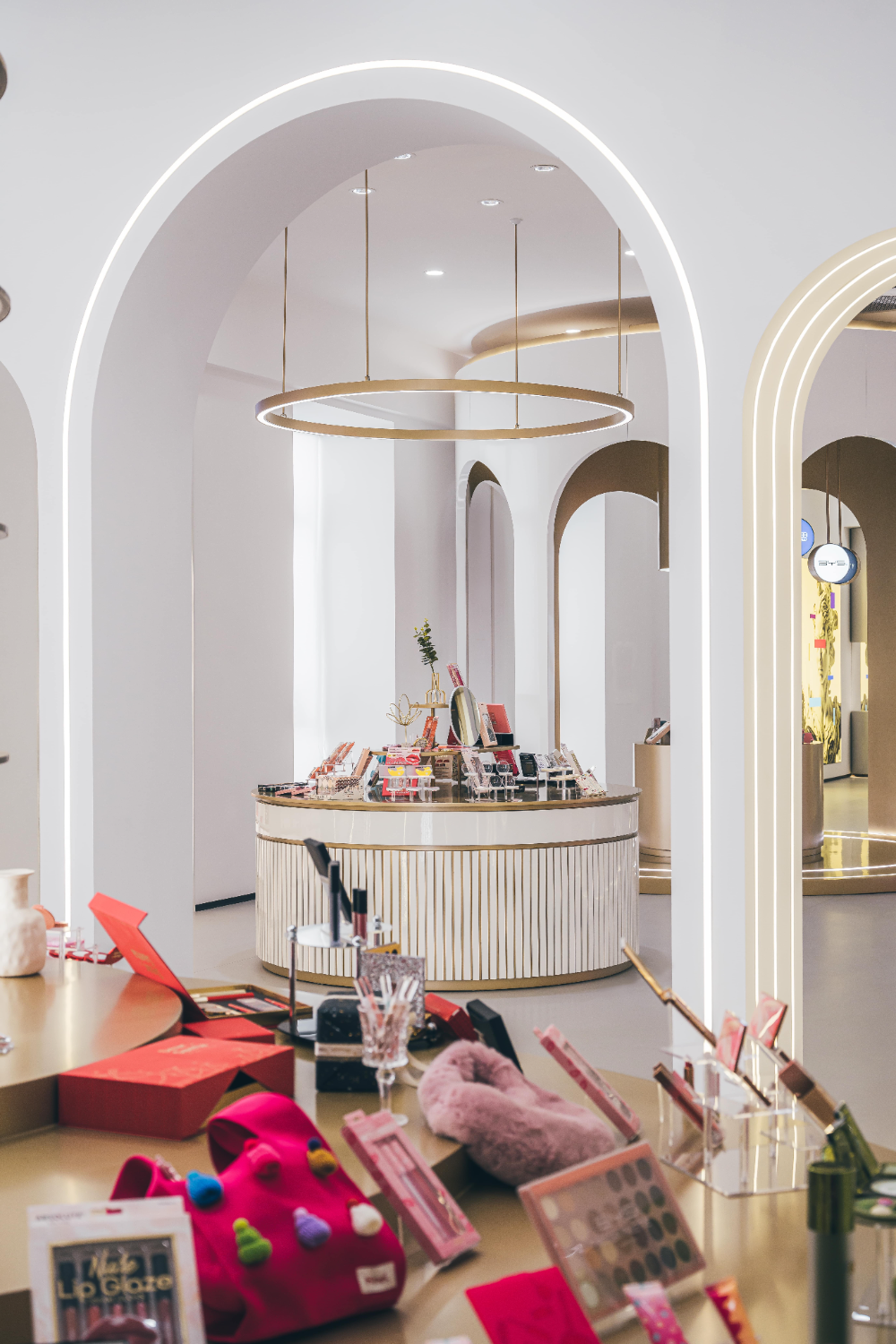
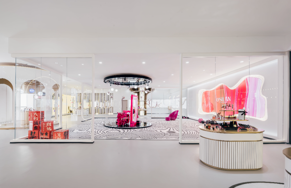
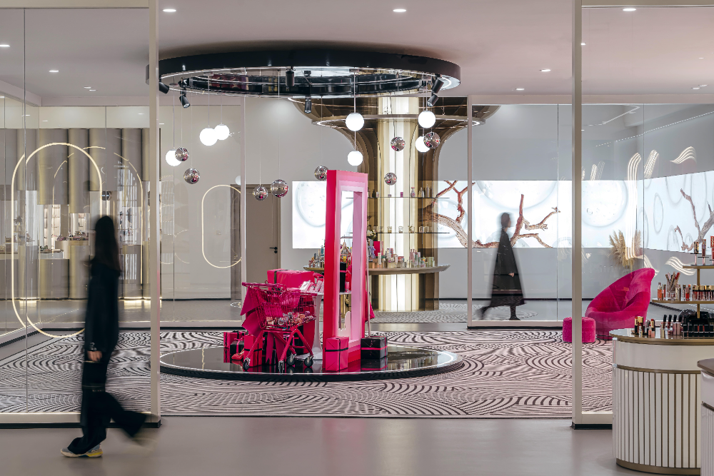
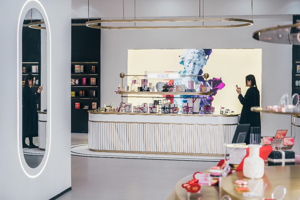
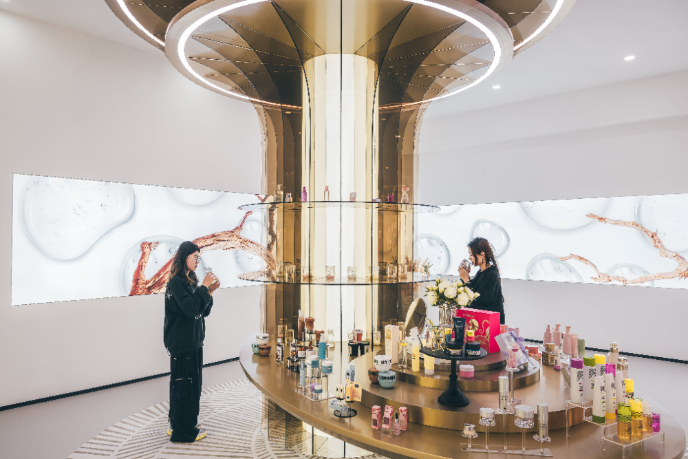
将整个展示空间按照四大部分功能进行切块,分别为包材区、企业文化展示区、展厅以及仓库。展示空间的整体方向围绕感官体验以及欧美元素的融入而展开,利用装置造型、材质、商品陈列、智能数字化屏幕影像、背景音乐等,展示和传递着本季度业务向欧美国家拓展的信息。展厅依据感官的分类并结合所需陈列的商品价值、功能、研发、合作方、季度主题等划分为七个功能区,分别为彩妆区、新品展示区、高端客户展示区、以往商品陈列区、护肤品区以及主题展示区。展厅空间皆采用圆形或弧形的装置,弱化了规矩且带有棱角的长方形空间,并结合对角线的方式进行大小有序的排列布局。
Divide the entire display space into four main functional areas: packaging area, corporate culture display area, exhibition hall, and warehouse. The overall direction of the exhibition space revolves around sensory experience and the integration of European and American elements, utilizing device shapes, materials, product displays, intelligent digital screen images, background music, etc., to showcase and convey the information of business expansion to European and American countries this quarter. The exhibition hall is divided into seven functional areas based on sensory classification and combined with the value, function, research and development, cooperation partners, quarterly themes, etc. of the products to be displayed, namely makeup area, new product display area, high-end customer display area, previous product display area, skincare product area, and theme display area. The exhibition hall space adopts circular or curved devices, weakening the regular and angular rectangular space, and combining diagonal lines to arrange the layout in an orderly manner.
©平介设计
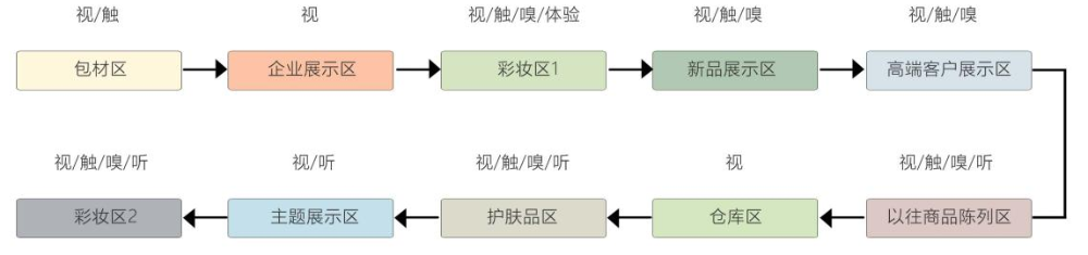
对于空间中的人流动线,本次设计注重以人流动线与空间之间相互作用的一种秩序感,以及穿插着自由的动线类型,避免了人群堆积的问题又能使参观者发挥自我意识与展品进行互动,更好的挖掘出空间中潜在意思。在整体空间的流线设计上则采用单一的串联式布局,按照线性顺序组合排列且非常明晰,简化不必要的干扰元素,从文化宣传—材质—产品的一种模式,使参观者的游览路线将展示与体验交叉进行,并随着游览路线的一步步推进和空间呈现内容的变化,除视觉和体验以外的其它感官也得到逐渐增加,参观者在展示空间内的情绪也逐渐发生变化。此外,在感官体验下的展示空间设计实践中,展厅则作为展示空间的重要节点,其客源数量相比于其它功能区域也较为聚集。
For the flow of people in the space, this design emphasizes a sense of order through the interaction between the flow of people and the space, as well as the interweaving of free flow types, which avoids the problem of crowd accumulation and allows visitors to develop self-awareness and interact with exhibits, better excavating the potential meaning in the space. In the overall space flow design, a single serial layout is adopted, which is arranged in a linear order and is very clear, simplifying unnecessary interference elements. From a mode of cultural promotion material product, the visitor's tour route will intersect display and experience, and as the tour route progresses step by step and the content of the space presents changes, other senses besides vision and experience are gradually increased, and the visitor's emotions in the display space also gradually change. In addition, in the design practice of exhibition space under sensory experience, the exhibition hall serves as an important node of the exhibition space, and its customer base is relatively concentrated compared to other functional areas.
©平介设计
© 徐英达
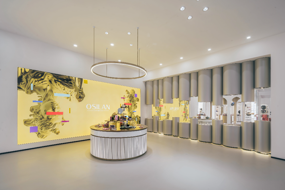
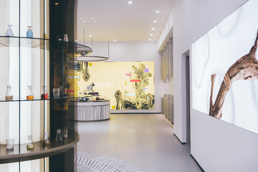
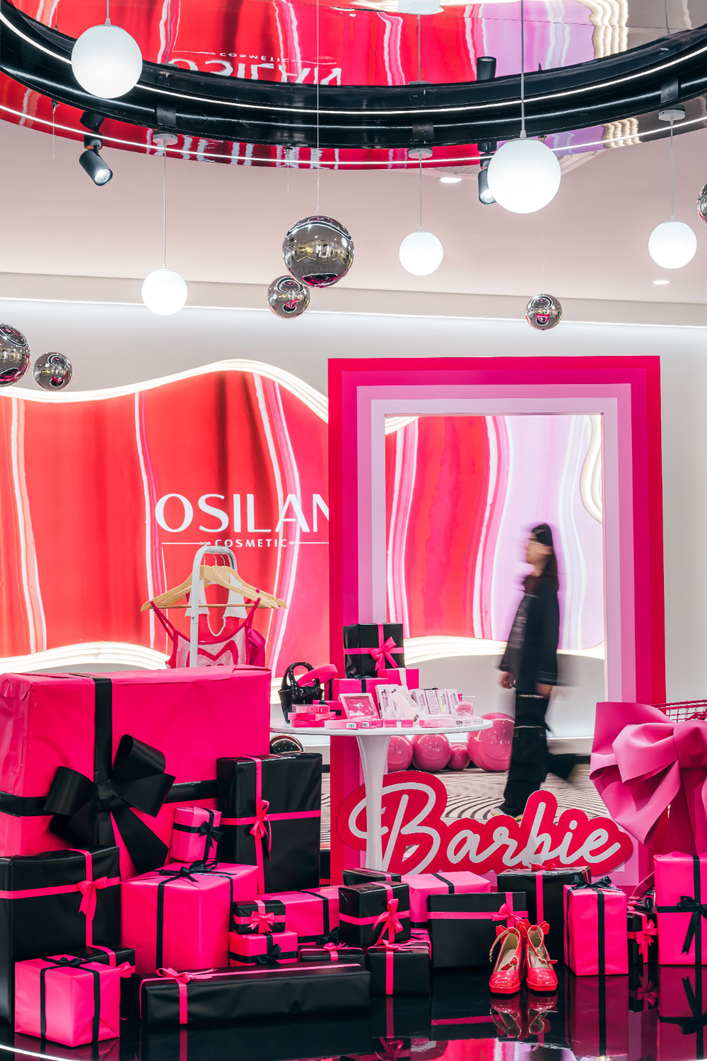
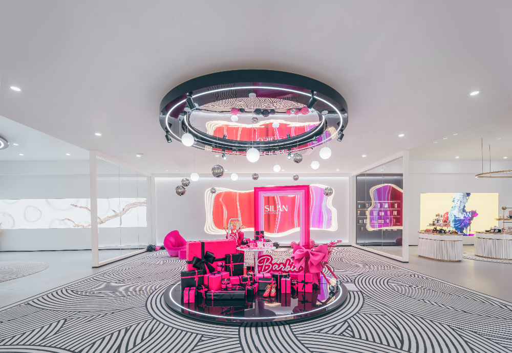
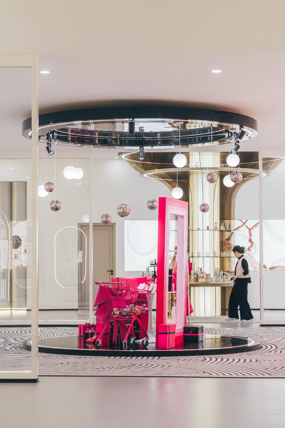
在展厅空间设计上围绕本季度业务向欧美国家拓展的信息以及以芭比元素为主题进行展开,以当代的手法进行演绎来彰显具有品牌特性的企业展示空间。将观赏、交互、产品体验加入到展厅空间中,并使用不同的材料进行叠加,形成截然不同的质感来寻求材料性上的对比。高贵的金色、端庄的白色、妩媚的粉色,以及时尚界经典的黑色,无不逐一的散发着女性的魅力。
In the design of the exhibition hall space, the focus is on the expansion of business to European and American countries this quarter, as well as the theme of Barbie elements. Contemporary techniques are used to interpret and showcase the brand characteristics of the enterprise's exhibition space. Incorporating viewing, interaction, and product experience into the exhibition space, and overlaying different materials to create distinct textures, in order to seek contrast in material properties. Noble gold, dignified white, charming pink, and classic black in the fashion industry all exude the charm of women.
© 徐英达
▼ 视觉体验
© 徐英达
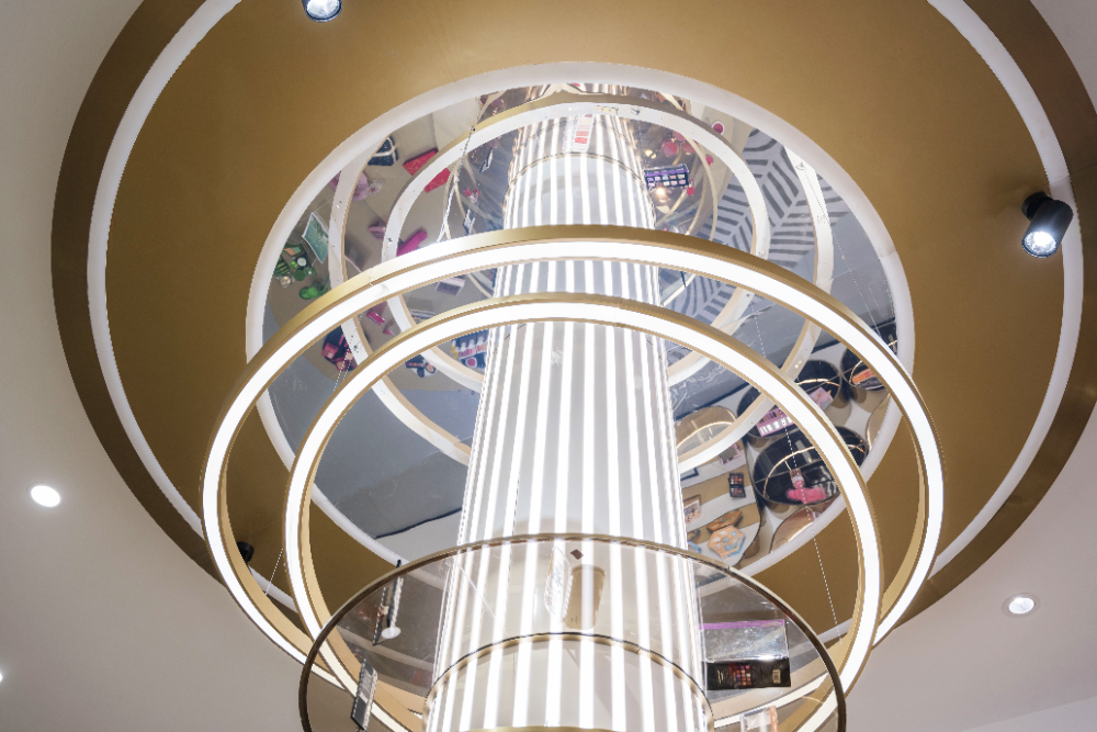
通过人造光和自然光的折射使参观者的视觉系统开始运作,并结合空间中的点、线、面、色彩等这些基础要素的组合,对空间形成一个立体意识。
Through the refraction of artificial and natural light, the visual system of visitors begins to operate, and combined with the combination of basic elements such as points, lines, surfaces, and colors in the space, a three-dimensional consciousness is formed for the space.
© 徐英达
© 徐英达
© 徐英达
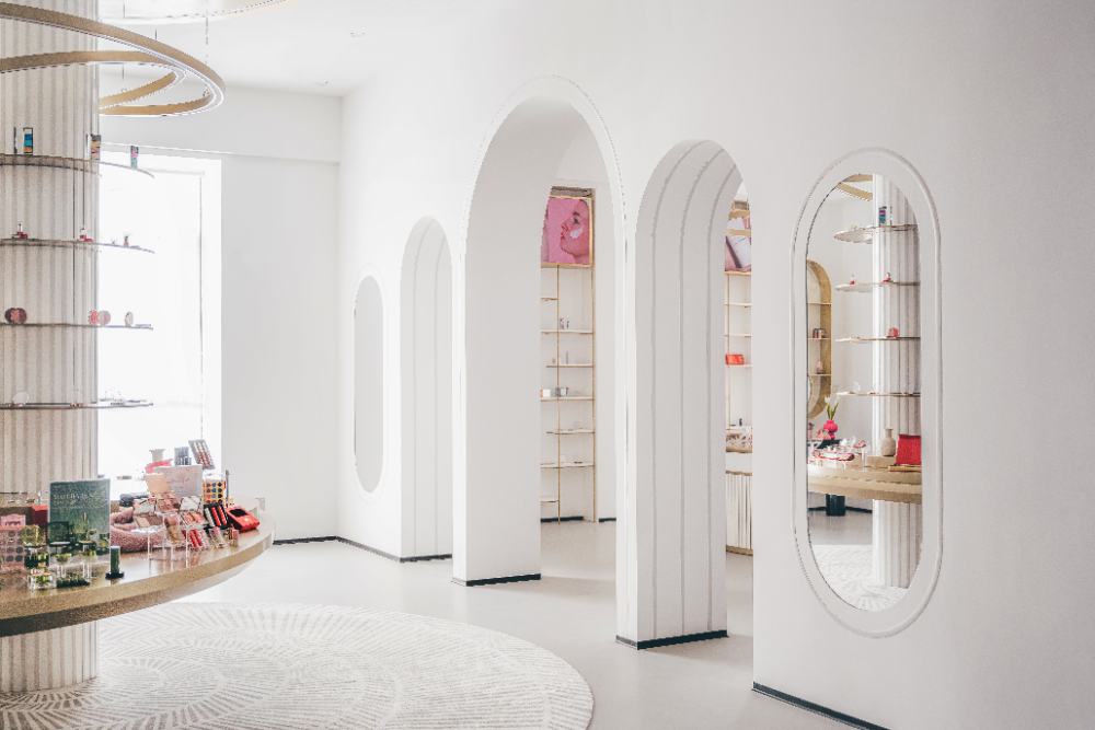
展厅空间中除了运用仿照西式风格的拱门形态墙体作为区域之间的隔断外,还通过装置将空间进行划分,引导参观者在空间中的动线走势。
In addition to using arch shaped walls modeled after Western style as partitions between areas in the exhibition hall space, the space is also divided through installations to guide visitors' movement in the space.
© 徐英达
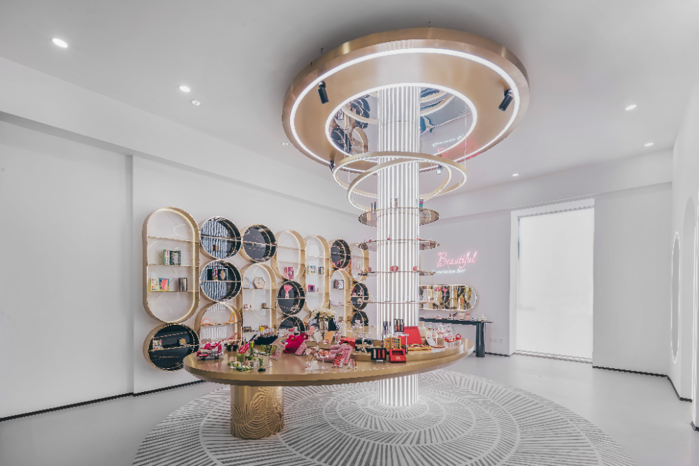
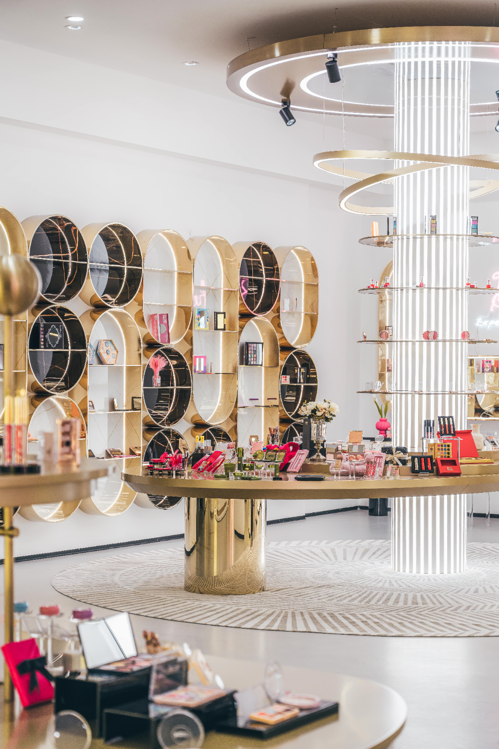
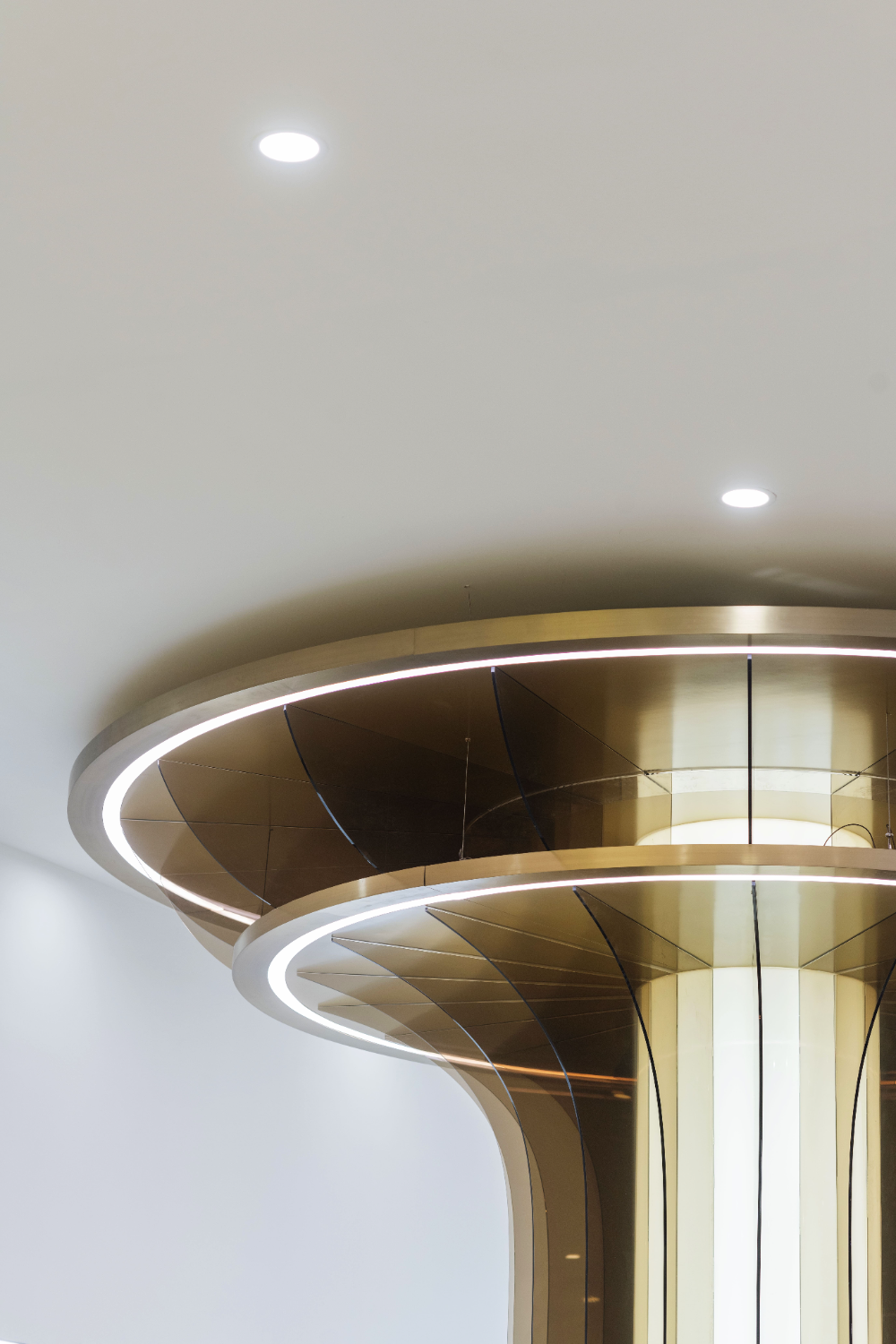
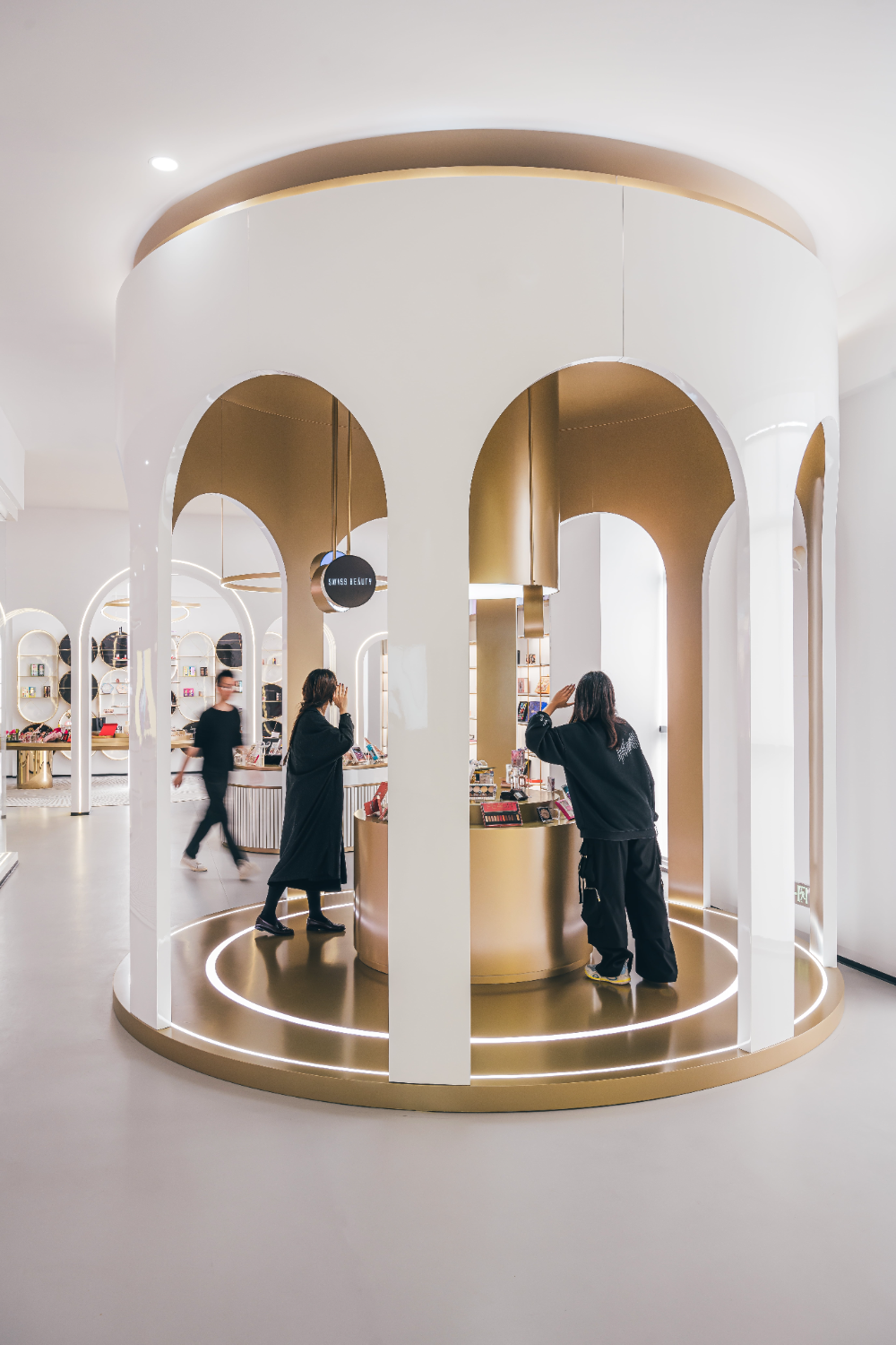
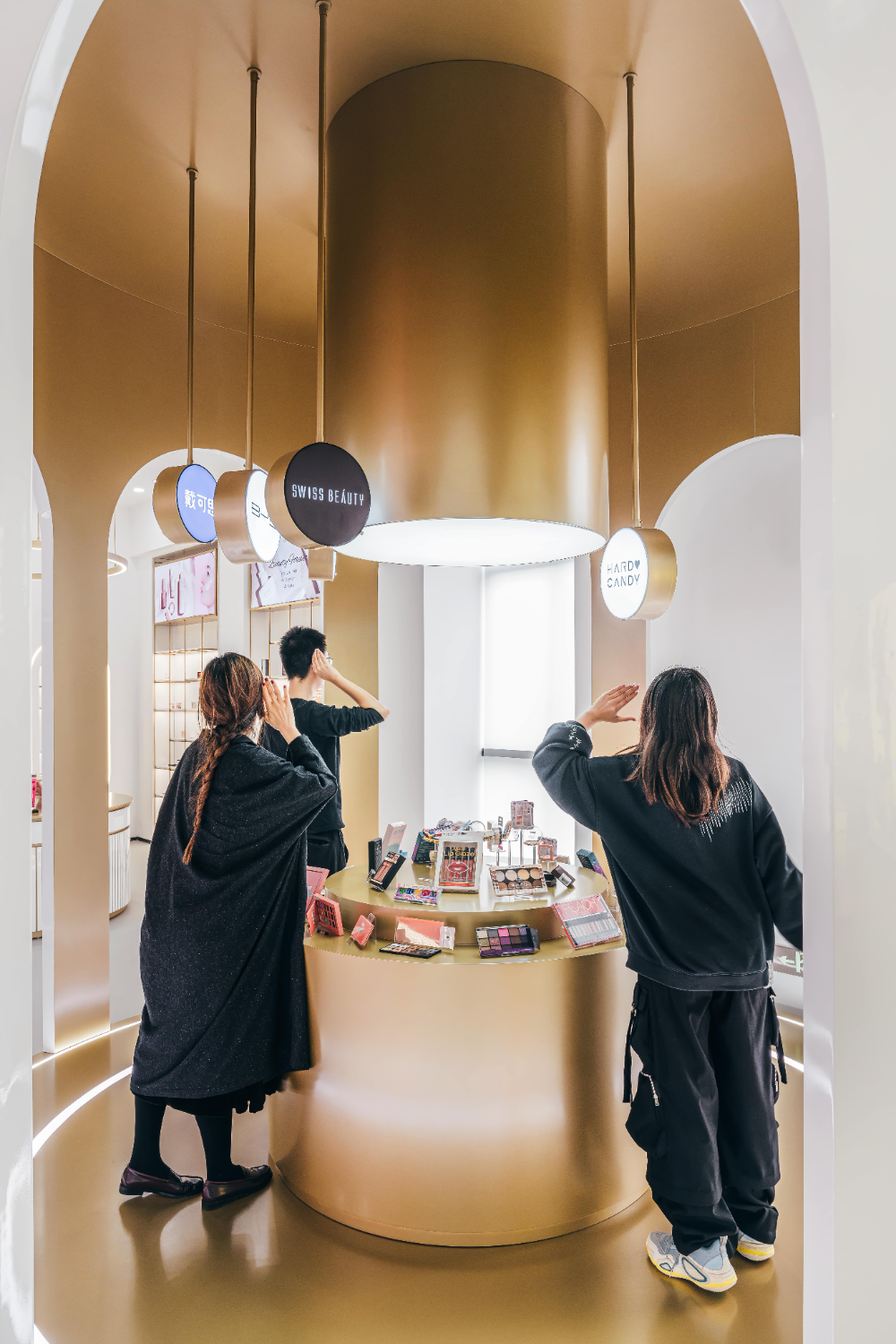
彩妆区在造型元素上借鉴了欧洲女性的层叠式裙装以及克利诺林裙撑的形式,并以大大小小的圆和椭圆的形式进行穿插、叠加进行体现,具有支撑作用的立柱采用LED灯镶嵌的手法,并结合飘带的形式层层旋转并缠绕在立柱上的玻璃展示架上,以此来弱化支柱的力量感和存在感。
The makeup area draws inspiration from the layered skirts of European women and the form of a crinoline skirt brace in terms of styling elements, and interweaves and overlays them in the form of large and small circles and ellipses. The supporting pillars are embedded with LED lights and combined with the form of ribbons to rotate and wrap around the glass display shelves on the pillars layer by layer, in order to weaken the sense of power and presence of the pillars.
© 徐英达
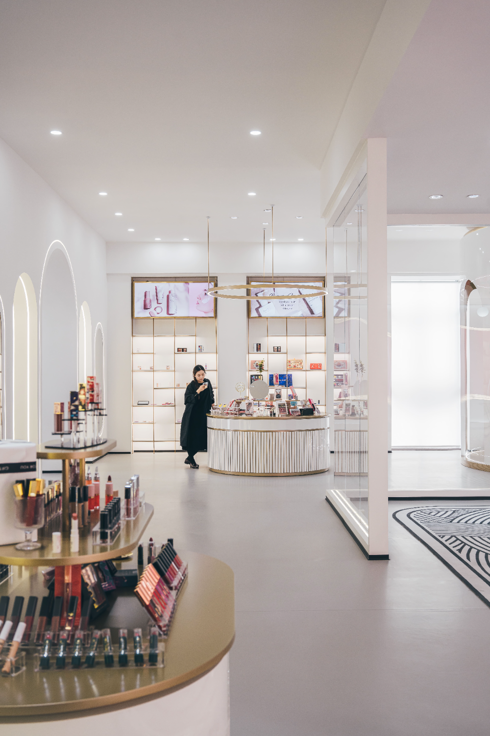
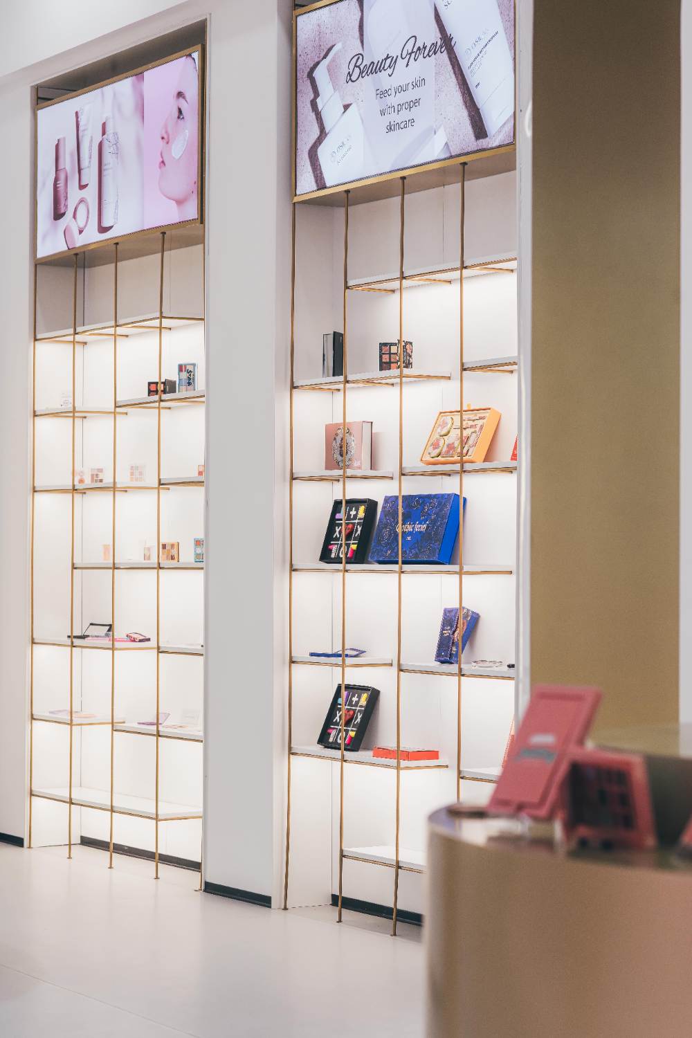
新品展示区与以往商品陈列区的装置,两者以高端商品展示区的装置为中轴线,对称且造型一致铺设开来。两个区域的展示台采用重心向下的方式,与高端商品展示区呈重力向上的装置区分开来,并且两个区域使用圆形吊灯的方式以此达到三者视觉上的高度统一。以往商品陈列区的墙面安装大面积的数字屏幕,其目的不仅是为了陈列出产品的更新迭代,还为了展现各大品牌的企业合作方,以此达到一种该品牌的业界认可度与知名度。
The new product display area and the previous product display area are symmetrically and uniformly laid out with the high-end product display area as the central axis. The display stands in the two areas are designed with a downward center of gravity, distinguishing them from the high-end product display area with a gravity upward device. Additionally, circular chandeliers are used in both areas to achieve a high degree of visual unity among the three. In the past, large digital screens were installed on the walls of the product display area not only to showcase the updates and iterations of products, but also to showcase the business partners of major brands, in order to achieve industry recognition and awareness of the brand.
© 徐英达
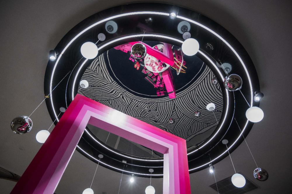
高端商品展示区的装置造型将犹如蝴蝶翩翩起舞形式的金属吊灯和星空顶,以礼盒的形式喻义将一切美好和浪漫包裹其中。
The installation design of the high-end product display area will resemble a metal chandelier and starry sky ceiling in the form of a butterfly dancing gracefully, symbolizing all beauty and romance in the form of a gift box.
© 徐英达
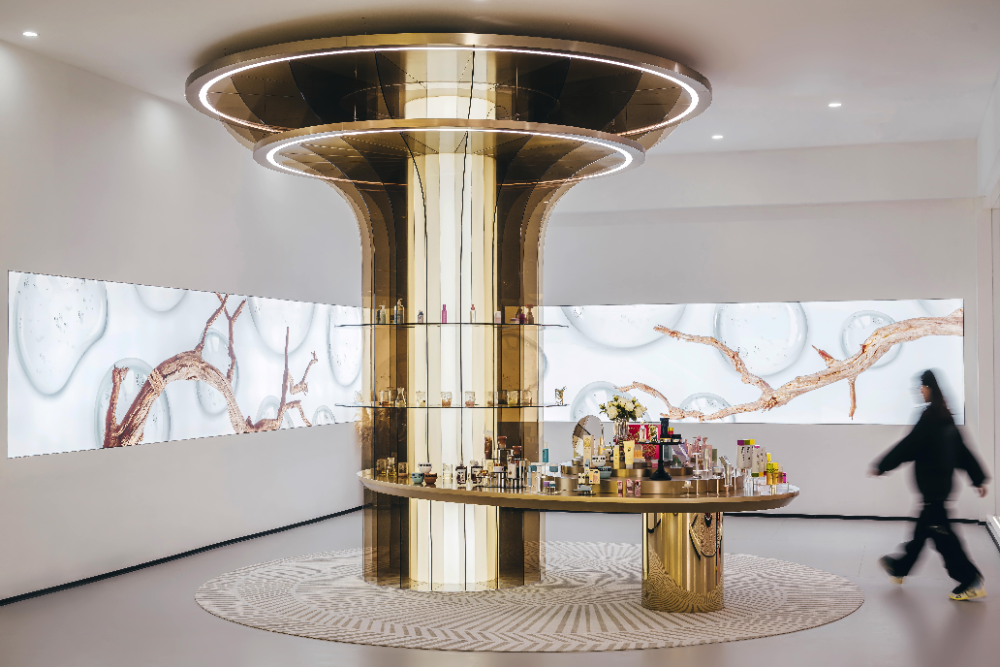
护肤品区为了体现出产品的质量,以蓝色作为背景色代表其成分的天然、纯净。运用大面积的墙面数字化屏幕,呈L型铺设开来。装置造型采用树的结构,将制作成弧形的彩色亚克力呈顺时针的方向依次穿插在白色亚克力发光柱上,犹如向上伸展的树枝,并搭配条形花纹地毯,犹如树根一样向四周蔓延的生命力。浅金色不锈钢材质的展台与亚克力材料的对比,虚与实的结合,模糊两者之间的界限,通过数字化屏幕内容的色彩变化,其装置在反射与折射的多重影响下创造出不同的光感变化。
In order to reflect the quality of the products, the skincare area uses blue as the background color to represent the natural and pure ingredients. Using a large area of digital wall screens, laid out in an L-shape. The device adopts a tree like structure, with colored acrylic made into an arc shape interwoven in a clockwise direction on white acrylic luminous columns, resembling upward extending branches, and paired with a striped carpet, spreading vitality around like tree roots. The contrast between the light golden stainless steel material booth and the acrylic material blurs the boundary between the virtual and the real. Through the color changes of digital screen content, the device creates different light perception changes under the multiple influences of reflection and refraction.
© 徐英达
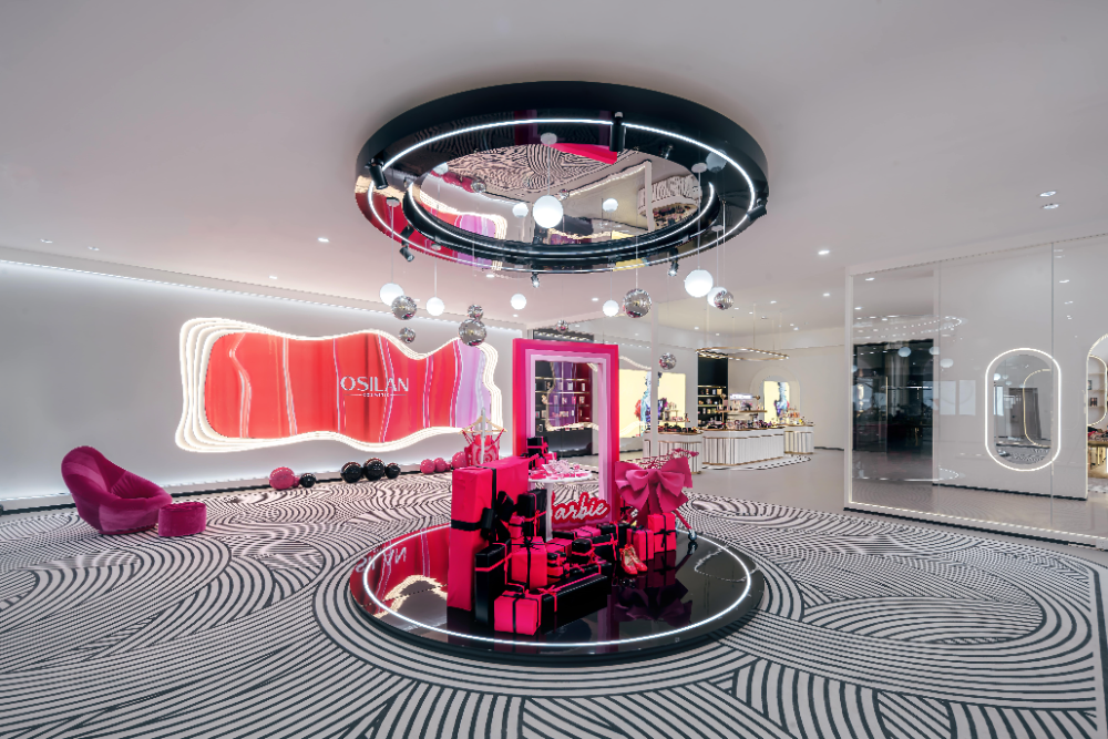
主题展示区的装置造型采用芭比公主的梦幻元素,将化妆品制作成超大的艺术装置,也是在很多展览中都会采用的吸人眼球和打造空间中心点的软装搭配手法。
The installation design of the theme display area adopts the dreamy elements of Barbie Princess, making cosmetics into oversized art installations, which is also a popular soft decoration matching technique used in many exhibitions to attract attention and create the center point of the space.
© 徐英达
在展示空间中,包材区内部陈列着更新迭代的产品及包装。企业文化展示区梳理着自公司成立以来到现如今的发展脉络及成就等信息映入参观者的眼帘。
In the exhibition space, the packaging area displays updated and iterated products and packaging. The corporate culture exhibition area presents information on the company's development and achievements since its establishment to the present day, which catches the eye of visitors.
© 徐英达
© 徐英达
© 徐英达
© 徐英达
© 徐英达
© 徐英达
© 徐英达
© 徐英达
© 徐英达
▼ 听觉体验
© 徐英达
声音能够创造沟通与参与,并具有吸引参观者注意力的效果,通过听觉的感受可以激发参观者的情绪和脑部的思考,从而使其得到丰富感受的层次。在空间中,听觉主要基于工作人员对参观者进行产品等设计理念的阐述,以及企业文化展示区和展厅区域的设备等。如:护肤品区域的装置会随着穿插在白色亚克力发光柱上的彩色亚克力片,光的流射呈纵向流射并伴随着发出声音。相对于传统的以图片、文字和产品向参观者传递信息而言,此空间对于听觉的设计,可以使参观者的听觉与视觉形成关联,更好的增强空间立体感,并且起到舒缓心理的作用,使参观者延长在展示空间中的停留时间,强化服务的效果。
Sound can create communication and participation, and has the effect of attracting visitors' attention. Through auditory perception, it can stimulate visitors' emotions and brain thinking, thus providing them with a rich level of experience. In the space, auditory perception is mainly based on the staff's explanation of product design concepts to visitors, as well as the equipment in the corporate culture exhibition area and exhibition hall area. For example, the device in the skincare area will be interspersed with colored acrylic sheets on the white acrylic luminous column, and the light will flow vertically accompanied by sound. Compared to traditional methods of conveying information to visitors through pictures, text, and products, the design of this space for auditory perception can establish a connection between visitors' auditory and visual senses, better enhance the three-dimensional sense of the space, and have a soothing effect on their psychology, allowing visitors to extend their stay in the exhibition space and strengthen the effectiveness of the service.
© 徐英达
▼ 触觉体验
© 徐英达
触觉是一种更直接的感受,它可以将参观者融入周围的空间中。参观者通过与真实事物的接触而产生反应,并对整体空间融入自我的主观感受,从而对空间、产品以及设计等信息产生更深刻的理解。在包材区,参观者可以对产品的包装材质,感受到肌理的变化的同时也能感受到产品包装设计的演变过程。
在设计上通过对装置造型进行改造,以及材质的对比使用,产品的体验来达到参观者的触觉认知。如:设立在入口处的两个彩妆区,一是围绕产品展开,二是围绕对产品的体验,参观者不仅可以在展厅内进行简单的与产品接触外,还可通过上妆的方式,感受产品的质感及效果等。此外,整个展示空间定位的是高奢风格,其在设计时所用到的材质大多为金属质感,并使用亚克力、白色烤漆木饰面等材料搭配作为点缀。参观者可以通过对材料的接触,而更容易的清晰捕捉到产品的定位。
Touch is a more direct sensation that can immerse visitors into the surrounding space. Visitors react through contact with real things and integrate their subjective feelings into the overall space, thereby gaining a deeper understanding of information such as space, products, and design. In the packaging area, visitors can experience the changes in texture and the evolution of product packaging design through the use of packaging materials.
By modifying the design of the device and comparing the use of materials, the product experience is achieved to enhance visitors' tactile perception. For example, there are two makeup areas set up at the entrance, one centered around the products and the other around the experience of the products. Visitors can not only have simple contact with the products in the exhibition hall, but also feel the texture and effect of the products through makeup application. In addition, the entire display space is positioned in a high luxury style, with most of the materials used in its design being metallic in texture, and embellished with materials such as acrylic and white painted wood veneer. Visitors can more easily and clearly capture the positioning of the product through contact with the materials.
▼ 嗅觉和味觉体验
© 徐英达
嗅觉和味觉与人的情感和记忆紧密相连。嗅觉反应会即时且直接地延伸至大脑,且气味常常伴随着多种感官联觉作用。空间中本季度的展品包括彩妆以及护肤品都是围绕自然、原生态等展开,打造成分安全的理念,参观者在空间中可以通过闻产品本身的气味来分辨添加的内容,以及开设相关区域进行原材料的体验,从而使参观者对产品制作过程产生联想。
随着技术、材料等不断地更新,以及通过感官与感官之间的相互交织、相互增强,使得展示形式和空间设计能给予参观者更加震撼的、真实的沉浸体验,不仅可以提升参观者和合作方的满意度,也能有效地传播其展示目的等信息,为其商业带来新的发展机会。
Smell and taste are closely linked to human emotions and memory. The olfactory response extends immediately and directly to the brain, and odors are often accompanied by multiple sensory synesthesia. The exhibits of this quarter in the space, including cosmetics and skincare products, are all centered around nature, original ecology, etc., creating the concept of ingredient safety. Visitors can distinguish the added content by smelling the scent of the products themselves in the space, and set up relevant areas for raw material experience, thus making visitors associate with the product manufacturing process.
With the continuous updating of technology, materials, and the interweaving and mutual enhancement of senses, the display form and spatial design can provide visitors with a more shocking and authentic immersive experience. This not only enhances the satisfaction of visitors and partners, but also effectively spreads information about their display purposes, bringing new development opportunities for their business.
项目信息--
项目名称:欧思兰化妆品展厅
项目类型:展厅设计、美妆店铺设计、美妆陈列道具设计、美妆展厅设计
项目地址:中国浙江省湖州市吴兴区湖州欧思兰化妆品有限公司
客户:湖州欧思兰化妆品有限公司
建筑设计/景观设计/室内设计/软装设计:平介设计
主创及设计团队:李筱葳,杨楠,常博文
建筑面积:400㎡
设计年份/建成年份:2024
摄影版权:徐英达
最近发布
-
2025-11-11
-
2025-11-11


